Custom Mobile Menu
Divi Pixel empowers you to design a fully customized mobile menu with ease using the Divi Builder. Its built-in settings ensure seamless integration, automatically triggering the popup menu when the Hamburger Icon is clicked. Additionally, the options in the Divi Pixel dashboard let you specify the desired menu and mobile menu layout where your custom mobile menu should be displayed.
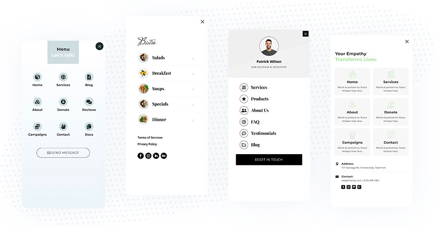
Design a Custom Mobile Menu
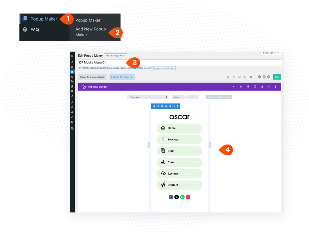
To design the custom mobile menu, we will use the Divi Pixel Popup Maker.
- Go to your WordPress dashboard, and navigate to the Popup Maker custom post type
- Click Add New Popup Maker
- Add a Title for your Mobile Menu layout
- Design your Mobile Menu using the Divi Builder
Layout Setting
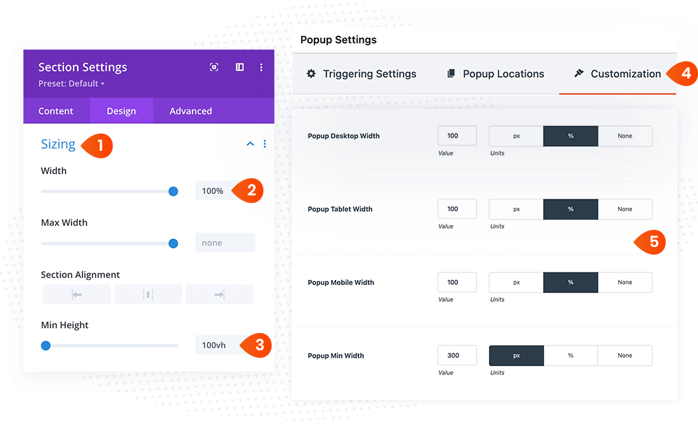
Here are the recommended layout settings to make the mobile menu full width and height.
- In the Section settings, go to Design → Sizing
- Set the Width to 100%
- Set the Min Height to 100vh
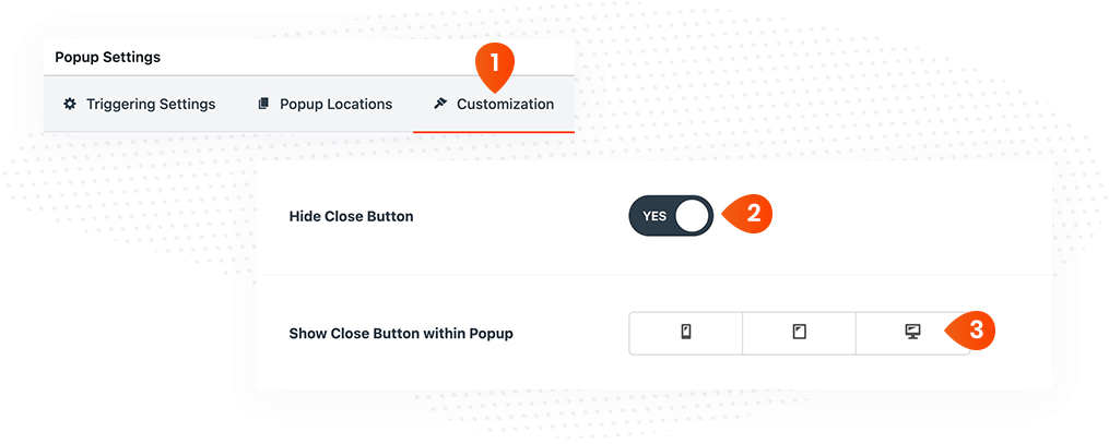
- In the Popup Maker settings, click the Customization tab
- Add 100% width to all devices
- Save the page
Adding Custom Close Button
By default, the Popup Maker displays the close button across all devices. However, you can disable this default close button in the Popup Maker settings and add a custom element to your layout that will close the popup or mobile menu when clicked. Follow the steps below if you’d like to display a custom close icon or element.
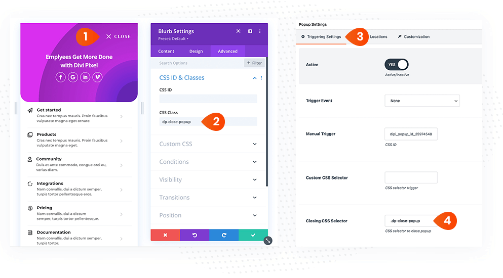
In the sample below, we added the Blurb module with icon.
- Add Blurb or any other module to your mobile menu layout
- In the module settings, add custom CSS Class in Advanced → CSS ID & Classes toggle
- In the Popup Maker settings, navigate to Triggering Settings
- Add Closing CSS Selector followed with dot (CSS Class)
In this last step, disable the default Popup Maker Close Icon in the Popup Maker settings.
- In the Popup Maker settings, select the Customization tab
- Enable the Hide Close Button option
- Deselect all devices in Show Close Button within Popup section
- Save Page
Setting up the Mobile Menu
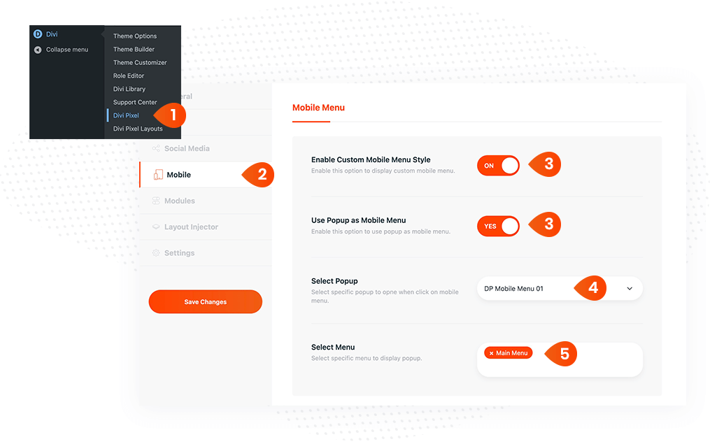
The custom mobile menu layout can now be triggered using the native hamburger icon.
- In WordPress dashboard, navigate to Divi → Divi Pixel
- In the left sidebar menu, select Mobile tab
- Scroll down and enable the Custom Mobile Menu Style and Use Popup as Mobile Menu options. Note: Fullscreen Mobile Menu option must be disabled
- Select the mobile menu layout you previously created using the Popup Maker
- Select the Menu where the custom mobile menu should apply
- Save Changes
Using Mobile Menu Templates
Prebuilt mobile menu templates are available for download on the Divi Pixel website. Once imported, these templates serve as an excellent starting point for creating your own custom mobile menu. They come pre-configured and are designed to work seamlessly.
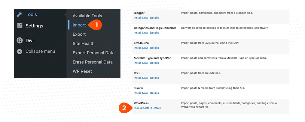
- In WordPress dashboard, navigate to Tools → Import
- On the next screen click Run Importer link
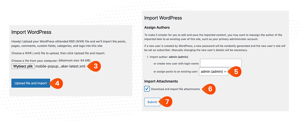
- Select the dp-mobile-menu.xml file
- Click the Upload file and import
- Create new user or assign import to the current user
- Select Download and import file attachments checkbox
- Click Submit button
The imported layouts can be found in your WP Dashboard under the Popup Maker custom post type.
Exporting Layouts
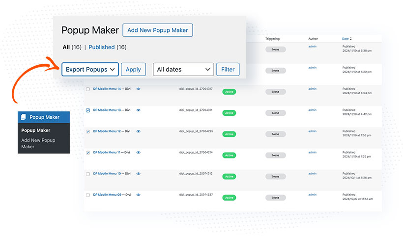
Divi Pixel includes a built-in exporter, enabling you to effortlessly export specific items from the Popup Maker custom post type.
- In your WordPress dashboard navigate to Popup Maker tab
- Select the items you would like to export
- From the dropdown menu, select Export Popup option
- Click Apply button
NOTE: If you are experiencing styling issues, where the Popup Maker/Mobile Menu is not displayed correctly on front-end, then make sure to clear Static CSS File in Divi → Theme Options → Builder → Advanced. This step is required, even when this option is disabled. In that case, enable that and click Clear button.
