
Spotlight Effects
Meet the Spotlight Effects feature for Divi 5! A soft pool of light that follows the visitor’s cursor across a card, a bright line running around its border, a slow glow drifting on its own while nobody is touching it — Spotlight Effects adds a cursor-aware highlight to any Divi 5 section, row, column or module, without a single line of code and without a separate module. Pick the look, the color, how far the light reaches and how strongly it burns, all per element and right inside the Visual Builder, with a live preview while you tune it.
Enabling Spotlight Effects
Spotlight Effects is a Divi Pixel feature, so it is switched on once from the plugin dashboard and is then available on every element you build.
- Go to Divi → Divi Pixel → General.
- Find the Spotlight Effects toggle group and turn on Enable Spotlight Effects.
- Click Save Changes.
NOTE: This feature is built for Divi 5. Once enabled, it adds a Spotlight Effects option group to the Advanced tab of every Divi 5 module, row, column and section.
Adding A Spotlight To An Element
- Open the page in the Visual Builder.
- Hover the section, row, column or module you want to light up and open its settings.
- Switch to the Advanced tab and open the Spotlight Effects group.
- Turn on Enable Spotlight Effect. The rest of the options appear, and the spotlight is live in the preview straight away.
- Move your cursor over the element to see it follow.
Spotlight Effects settings, styles and cursor modes
NOTE: The spotlight is drawn over the element you enabled it on and never captures clicks — buttons, links and forms below it keep working exactly as before. It follows the element’s own outline: rounded corners are inherited automatically, and the light covers the element’s border rather than stopping just inside it.
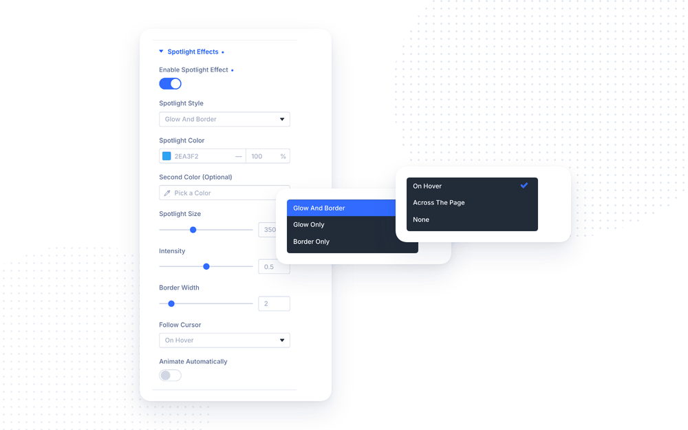
Spotlight Style
Spotlight Style decides what the light actually paints.
- Glow And Border — the full effect: a soft wash across the element plus a bright line tracking the cursor around the outline.
- Glow Only — just the wash, no outline. The subtlest of the three, and the safest choice on a busy background.
- Border Only — just the moving line on the outline, leaving the element’s own background untouched. Ideal for pricing tables and feature cards that already have a fill you do not want tinted.
Border Width sets how thick that line is, and is hidden while Glow Only is selected. On an element that already has a border of its own, leave it alone: the spotlight then lights up that border at its exact width instead of drawing a second, thinner line beside it. Set the field yourself and your value wins.
Color
Spotlight Color is the color of the light. The color picker’s opacity slider works as usual and is applied on top of Intensity, so a semi-transparent color gives you an extra-soft result.
Second Color (Optional) turns the single hue into a gradient: the light fades from the first color into the second as it spreads outward. Leave it empty for a single-color spotlight.
NOTE: Light colors read best on dark sections and deep colors on light ones. If the effect looks washed out, it is almost always the color fighting the background rather than the Intensity being too low.
Size And Intensity
- Spotlight Size — the diameter of the light in pixels. Small values give a tight, torch-like spot; large values wash the whole element. The border line uses a slightly tighter radius than the glow, so the two stay visually balanced at every size.
- Intensity — how strongly the light burns, from 0 to 1. The glow always stays considerably softer than the border line at the same setting, which keeps text readable underneath.
NOTE: Match Spotlight Size to the element you put it on. The light fades out over that distance, so a size far larger than the element lights all of it evenly — the spotlight stops looking like a spotlight, and an automatic animation has almost nothing left to show. On a small element such as a button, start around its own width and tune from there; the default suits a card or a section.
Follow Cursor
Follow Cursor decides when and how the spotlight reacts to the visitor.
- On Hover — the element stays dark until the cursor arrives, then the light appears and follows it. The default, and the right choice for cards in a grid.
- Across The Page — the element is lit all the time, and the light leans toward the cursor wherever it is on the page, so it reacts before the visitor even arrives.
- None — the cursor is ignored entirely. Pair this with Animate Automatically for a spotlight that simply moves on its own, or leave the animation off for a fixed glow in the centre of the element.
Animate Automatically
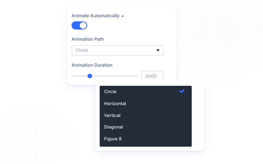
Turn on Animate Automatically and the spotlight moves by itself, so the element is alive even when nobody is pointing at it.
Animation path and duration options
- Animation Path — Circle, Horizontal, Vertical, Diagonal or Figure 8.
- Animation Duration — how many milliseconds one full pass along that path takes. Longer is calmer.
While Follow Cursor is set to On Hover or Across The Page, the visitor’s cursor takes over the moment it enters the element, and the animation resumes when it leaves — picking the path back up from the point the cursor left, rather than jumping to wherever its own clock had run to.
NOTE: The animation stops completely while the element is scrolled out of view, and never starts at all for visitors whose system is set to reduce motion.
Modules That Light Each Item
Some modules render a list rather than a single block. On those, the spotlight is applied to each item individually — enable it once on the module and every card lights up on its own as the visitor moves across the grid.
- Blog — one spotlight per post.
- Portfolio, Filterable Portfolio and Fullwidth Portfolio — one per project.
- Gallery — one per image.
- Blog Slider — one per slide, including the slides the carousel clones.
- Filterable Grid and Filterable Gallery — one per card.
The Button module is handled the same way, for a different reason: Divi wraps a button in a full-width container that is much larger than the button itself, so the spotlight goes on the button rather than on that invisible box.
NOTE: This happens automatically, with no extra setting to find. Items that appear later — a filter being applied, a slider cloning its slides, a new page of posts loading — are picked up and lit as they arrive.
Performance And Accessibility
Spotlight Effects is built to stay light on the pages that use it and invisible on the pages that do not.
- Nothing is loaded on pages where no element has the effect enabled — no scripts, no stylesheet. The feature ships no CSS file at all.
- The effect is drawn with the browser’s own gradients rather than a canvas, and the cursor is read at most once per frame no matter how fast it moves.
- An automatic animation stops while its element is off-screen, and does not run for visitors who have asked their system to reduce motion.
- The Visual Builder preview and the published page run the exact same code, so what you tune is what your visitors get.
NOTE: The most expensive setting is Spotlight Size on very large elements, since the light is painted across the whole area it covers. On a full-width section, prefer Border Only or a moderate size over a spotlight large enough to fill the entire section.