Advanced Tabs
The Advanced Tabs module for Divi allows you to add any information in separate tabs. You can add as many tabs as you need. Make your website’s appearance look classy and neat. With the Divi Pixel Dual Heading module, you can create truly amazing and unique text headers on your Divi website. This module allows you to add texts and customize them individually. The advanced settings available in this module let you create stroked texts, text with a clipped animated background, and even add an animated GIF image for the background.
Content Settings
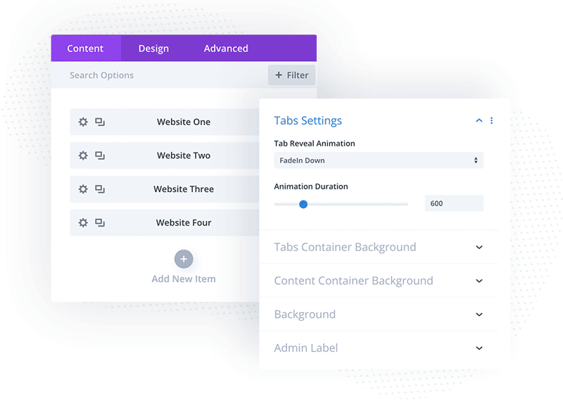
The Advanced Tabs module allows you to add an unlimited number of tabs. In the Content tab, you can add tabs, select content animation, and set tabs’ background and content background. You can select 1 of 19 pre-built animations and set Animation Duration, so switching between tabs is smooth and nice. As with any Divi module, you will also find an Admin Label in the Content tab, where you can add a tab title to be displayed in the content pane, making it easy to find the tab you want to edit.
Tab Content
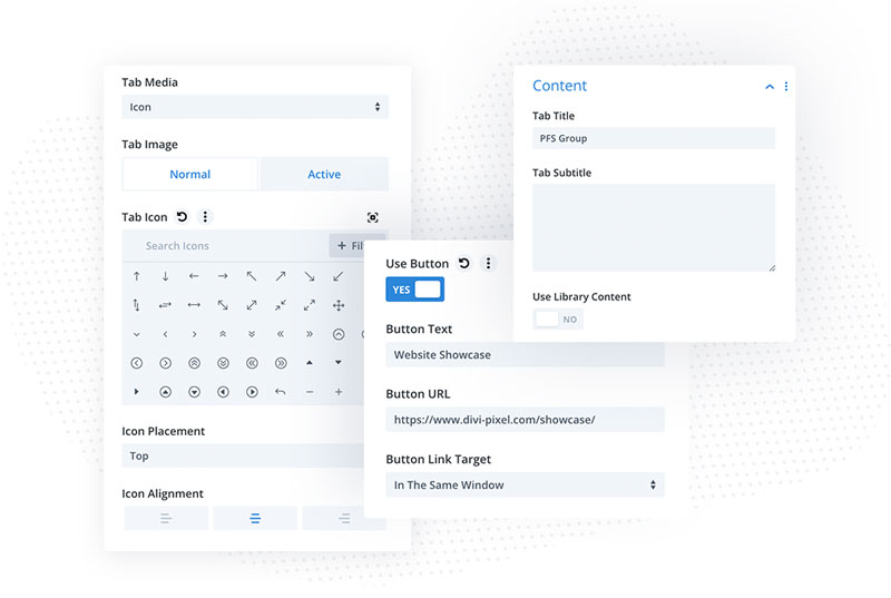
When the new tab is added, you can open its settings to add the tab title, description and icon or image. In each tab, you will also find fields for adding tab content. You can use manual content where images and text can be added, or use Divi Library content. For manual content, you can use the text field, add a button and add an image. The image has positioning settings, so you can display it above content, below content or on the left or right. The image added to the content has also customization settings available in each child module (Design/Image Style). Using these settings you can set image spacing, and add border and box-shadow.
Tab Icon/Image
The Advanced Tabs module allows you to add an icon or image to each tab. Their customization settings can be found in each child module’s Design tab.
Tab Icon
In the Tab Icon toggle, you can set the icon color and size for the Normal and Active tabs. The color setting has also a hover option, so if you wish to have different tab icon color on the hover state, you can tweak that here.
Tab Image Style
If you selected to display the image in the tab instead of an icon, you can customize it in the Design → Tab Image Style toggle where you will find settings for border and box shadow available for the normal and hover tab.
Button Customization
When you are using manual content and adding a button to each tab to be displayed within the content, you can customize these buttons in 2 places. If you want to use global settings, so the button style will be applied to all content in all tabs, then you should use global settings available in the parent module (Design → Button Style).
If you want to customize buttons for each tab content separately, you can set button styles in child modules (Child module → Design → Button Style).
Tabs Container Settings
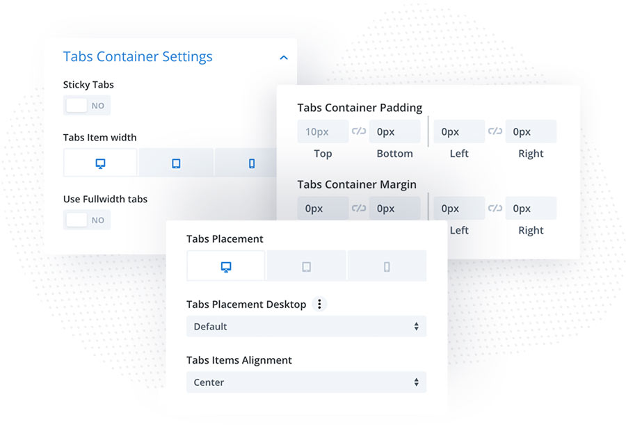
The Tabs Container Settings is one of the most important settings you need to tweak. This is where you can set how the tabs will be displayed on your site. You can select tabs container positioning, set single tab width (or make them full-width), make the tabs sticky if the content is longer and you want to always display tabs on the screen when the user scrolls.
Tabs Item Customization
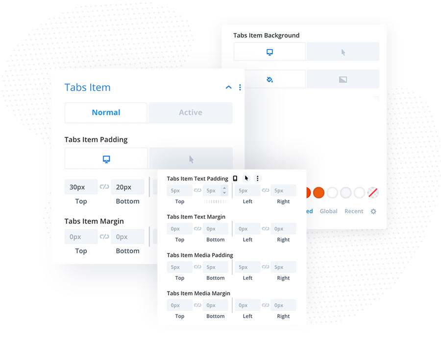
Tabs Items can be customized in the parent module in Design → Tabs Item. You can set the appearance of the single tab globally for the Normal and Active tabs. All settings have responsive options, so you can customize them for desktops, tablets and mobiles. In this toggle, you will find tab spacing, background, border, box-shadow and more. You can also adjust values for mouseover state to create amazing hover effects. It’s a good idea to use an inset box shadow for an active tab to create a unique effect.
Tabs Item Text
We have 2 toggles ( Tabs Item Text and Tabs Item Text Active) available for tabs text customization, We can customize normal and active tab text titles and descriptions. In these toggles, you can select the tabs text font, alignment, color, size and add text-shadow.
Content Area Settings
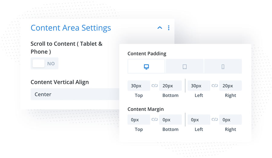
In this toggle, you can customize the content area. You can control spacing, select how content should be vertically aligned, and set content container border and box shadow. Scroll to Content is a useful option for mobile users. This option will be very handy for mobile phone visitors. When this option is activated, the page will scroll to the content after the tab is clicked.
Active Tab Arrow
In this toggle, you can enable an arrow that will be added to the active tab. When it is enabled, you can select arrow color, size and alignment.
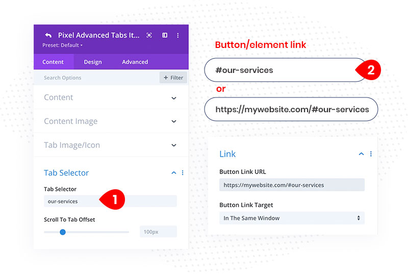
Tab Selector
To open a specific tab when a tab selector is clicked, follow these steps: First, add the Tab Selector to the Advanced Tabs child module. Then, use it as an anchor link for the element that should trigger the action. If you want to open a tab from a different page, you will need to use the full URL link. However, if the element is on the same page, an anchor link will suffice.
- Add Tab Selector to the child module (single tab)
- Add this selector to the link element you want to trigger the tab
