Hover Gallery
Interactive websites are easier to attract the attention of visitors. It is a great idea to allow users to discover the page by interacting with it. And Divi Pixel modules do just that. The Hover Gallery is a unique and creative tool that will allow the creation of interactive and engaging sections. It enables you to build a grid of content boxes where each grid item can have the main image, icon, title, description, and button. The main pictures are revealed after the user hovers or clicks the single grid box.
Content Settings
The Hover Gallery module allows you to add multiple grid items with images or icons, titles, descriptions, and buttons. In the child module Content tab, you will find three custom toggles: Image, Content, and Alignment.

Grid Settings & Animations
The Hover Gallery module gives you complete control over the grid layout. You can customize the number of columns and spacing and set grid position and width. Seven animation effects are available that will make your Hover Gallery spectacular. There is also an option to enable the Autoplay mode, so your grid items will switch automatically after the defined delay.
The Hover Gallery grid and animation can be customized in the parent module Content → Grid Settings.

Customization
The Hover Gallery module is highly customizable. After adding content to each grid item, you can customize each element using the advanced module settings. This module has also been developed so you can use different styles for each content box separately, as the customization options are available in the parent and child modules.
Eight custom toggles are available, where you can customize grid items’ appearance, images, texts, and buttons. Each toggle has two states: Default and Active which allows you to customize the default grid item appearance, and active (on hover or click).

Global vs. Child Item Settings
There are two ways to adapt this module to your needs. You can use global settings to use the same styles for each grid item. And if you want to style each card individually, child module settings should be used.
Global Settings
Global settings are available in the parent module and will apply to each grid item element if you don’t enable custom styles in the child modules. If you want all cards to be the same, then using a global setting is the way to go. Style the default and active item elements separately to create a nice mouseover effect.

Child Item Settings
All styles found in the parent module are also available in the child modules. This means that you can customize each grid item individually. These options will be helpful if you want each card to have different colors. If you go that route, it’s a good practice to create and customize 1 item, and then duplicate it and change only images and colors.

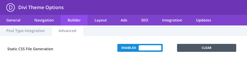
NOTE: If you are experiencing styling issues, where the Hover Gallery module is not displayed correctly on front-end, then make sure to clear Static CSS File in Divi → Theme Options → Builder → Advanced. This step is required, even when this option is disabled. In that case, enable that and click Clear button.