Gravity Forms Styler
Gravity Forms is a popular WordPress plugin used to create forms on websites. It is a powerful tool that enables website owners to create forms for various purposes, such as contact forms, surveys, registration forms, and more. Gravity Forms provides a range of customization options out of the box, but with Divi Pixel’s Gravity Forms Styler, users can take customization to the next level.
Getting Started
Before using the Gravity Forms Styler module, ensure that the Gravity Forms plugin is installed and a form has been created.
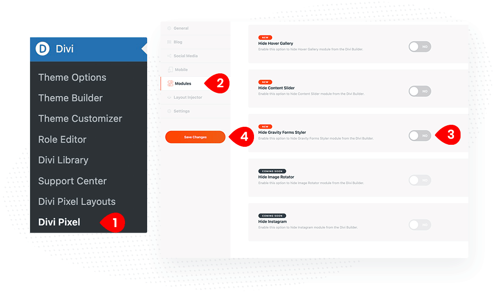
The Divi Pixel Gravity Forms Styler module is hidden by default, so it’s not loaded in the Divi Builder. To make the module available, enable it in the Divi Pixel settings. To do that, follow these steps:
- Go to the Divi Pixel plugin settings dashboard
- Select Modules from the left sidebar menu options
- Disable the Hide Gravity Forms Styler toggle
- Click Save Changes button

Content Settings
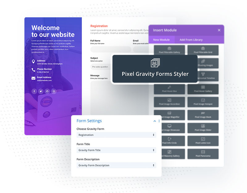
Effortlessly Embed Gravity Forms: With our streamlined integration, you can seamlessly add Gravity Forms to your Divi-powered website without dealing with shortcodes. Select the Gravity Forms module from the Divi Builder and quickly customize your forms.
To choose the form, open the module settings, and in the Form Settings toggle, select the form you want to customize. In this toggle, you can also choose whether or not to display the form title and description.
- Add Pixel Gravity Forms Style to the page using the Divi Builder
- In Content tab, locate the Form Settings toggle and click to expand it
- From the Form Settings toggle, you can select the form you want to customize from the drop-down menu
- Additionally, you have the option to show or hide the form title and description
Once you have selected your desired form and adjusted the settings, you can begin customizing the various form elements using the Divi Pixel Gravity Forms Styler module. With this powerful tool, you can achieve a personalized and cohesive form design that aligns perfectly with your Divi site’s brand and aesthetic.

Design Settings
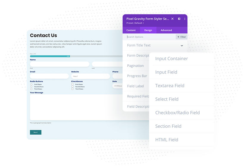
With these powerful customization options, you can perfectly tailor each form field. From fonts and colors to borders and backgrounds, the Design tab empowers you to create a visually stunning and cohesive form that seamlessly integrates with your Divi site’s design. To start customizing the form fields, head over to the Design tab. Here you can find 20+ new toggles where specific fields’ appearance can be customized.

Form Fields
Form Title & Description
Allows you to customize the form title and description. You can change fonts, colors, add text-shadow, and more.
Pagination
In the Pagination toggle, you can change the appearance of the pagination buttons.
Progress Bar
The Gravity Forms plugin allows you to create multi-step forms. In the Progress Bar toggle, you can customize the progress bar colors and height, add a border, and tweak the percentage label.
Field Container
These customization settings will apply to all fields. You can add spacing, change the background color, and add a border and box shadow. Adding custom styles to the field containers lets you quickly group fields to make your forms more user-friendly and effective.
Field Label
Each Gravity Forms field can have a label. In this toggle, you can customize the label font and color.
Required Field Indicator Text
If the field is mandatory, the “Required” text is displayed along with the field label. You can customize this text by changing the font and color in this toggle.
Field Description
Each field can have a description text below or above the input. To customize the field description, go to Design → Field Description.
Input Field
This toggle is divided into two tabs: General and Focus. All input fields will change their appearance by customizing settings in the General tab. In the Focus tab, you can customize the input field style when users click on it and enter the data.
Textarea/Multi Select Field
This field allows users to add a message as paragraph text. In this toggle, you can add spacing, change background color, and font, and add border and box shadow.
Select Field
Select fields let users choose one option defined in the Gravity Forms settings. By customizing settings in this toggle, you can change select field spacing, background color, and font and customize the dropdown and dropdown arrow.
Checkbox/Radio Field
With Gravity Forms, you can easily add checkboxes or radio boxes to your forms. In this toggle, you can customize their appearance.
Section Field
The Section field allows users to add a section with a title and description. In this toggle, you can customize the section field container and title and description texts.
HTML Field
With the Gravity Forms plugin, you can easily add an HTML code to your form. In this toggle, you can control field spacing, adjust fonts and background color, and add border and box shadow.
Consent Field
User consent is required for almost all forms. The Divi Pixel Gravity Forms Styler allows you to customize the consent field container, button, and label.
Confirm Message
After submitting a form, confirm message is displayed. Gravity Forms Styler allows you to customize this message by changing the background, adjusting fonts, adding spacing, and more.
Placeholder
The placeholder text can be used and displayed on all input fields. In this toggle, you can customize the placeholder text by changing font, color, and alignment.
Buttons
The Gravity Forms Styler allows you to customize form buttons. There are four toggles for customizing buttons. You can customize all buttons individually (Submit, Prev, Next). You can use the All Buttons toggle to apply the same styles to all buttons.