Horizontal Timeline
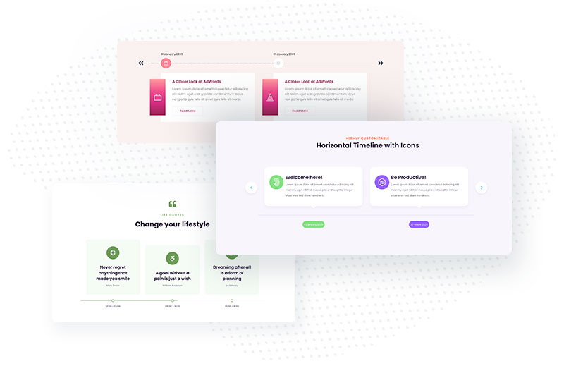
The timeline is one of the best ways to display chronological events in a neat and accurate style. A timeline is the presentation of a chronological sequence of related events along a drawn line that enables the reader to quickly understand time-related or time-limited relationships. Timelines provide a logical, clear way to tell your story. You can use it on the About Us page to showcase highlights or tell your business story through dates, among other things. But it can also be used to showcase products, process steps, team members, and more.
Content Settings
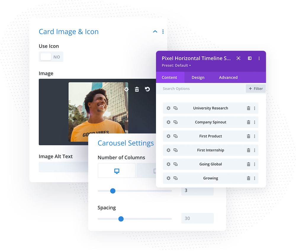
The Horizontal Timeline module allows us to add an unlimited number of cards. Each card can display an image or icon, card title, description and button. We can also add ribbon text that will be displayed on the opposite side of the timeline line.
Card Arrow
In Card Arrow, we can enable the arrow, so it will be displayed and will point the card to the timeline icon. When this setting is enabled, we can also change card arrow alignment to left, centre or right.
Carousel Settings
The Horizontal Timeline works similar to the Carousel module, but it also displays a timeline with icons. In Content Carousel Settings we will find options for customizing the carousel. We can set the number of columns, spacing, and animation duration, enable the loop and autoplay options, chose to open the card image in the popup lightbox, enable arrow navigation, enable pagination, and make the carousel centred.
Design
In the parent module, in the Design tab, we can customize elements globally. We have options for changing the layout, customising the card arrow, timeline line, timeline item texts, timeline card and timeline card button.
Layout
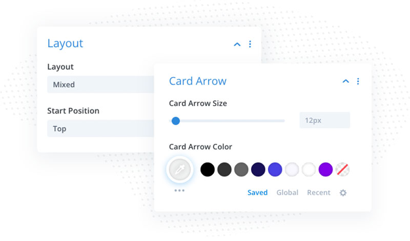
In Design → Layout, we can select one of the 3 layouts available. We can display timeline items above timeline, below, or use a mixed layout. When the missed layout is used, we can select the start position (Top/Bottom).
Card Arrow
In Design → Card Arrow we can change Card Arrow Size and color. If we want to change card alignment, but don’t want to display an arrow, then we can set the card arrow size to 0 or transparent color.
Timeline Line
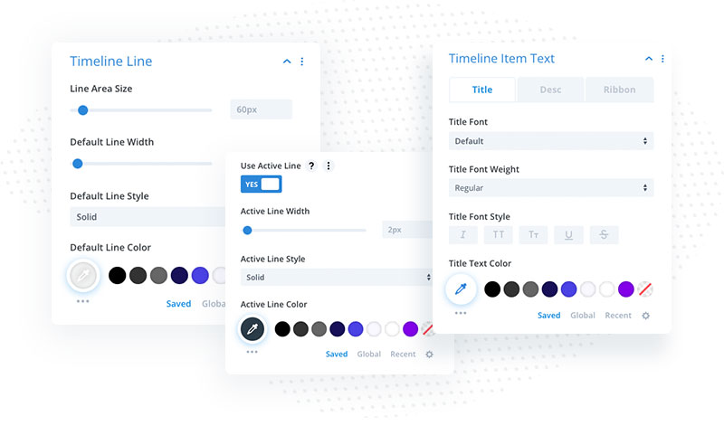
The Horizontal Timeline module allows customizing the timeline line. We can change the timeline area size, which will define the distance of the ribbon and card from the timeline. We can also customize timeline line width, style and color. In Design → Timeline Line we will also find the option to enable Active Line that allows us to customize active timeline line separately creating a nice effect.
Timeline Item Text
In Design → Timeline Item Text we can customize timeline card texts globally. If we want all cards to have the same style, this is the place where we should make adjustments. We can change fonts for the title, description and ribbon text.
Timeline Item
In Design → Timeline Item we can change the appearance of the timeline cards globally. We can add a border, set border color, and add a card shadow that will apply to all cards added to our timeline.
Button Customization
When we add buttons to our cards, we can customize them globally in Design → Button settings. Button settings are the same as in the native Divis Button module. We can customize button font, colors, add button icons, adjust button spacing and add button shadow.
Card Content
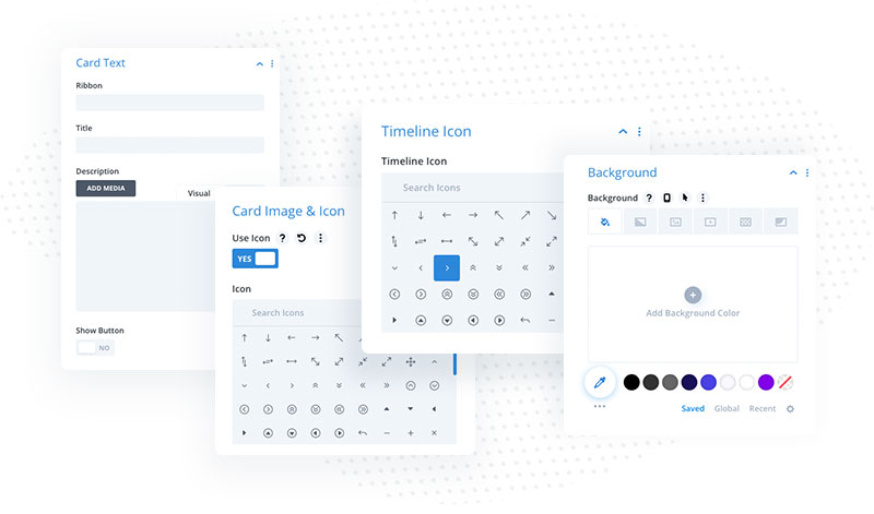
In the child module Content tab, we can add card text, image/icon, and chose timeline icon. If we don’t want each card to have the same background, we can select an individual background for the card in Content Background. There is also an Admin Label toggle where we can add admin text for the card that will be displayed in the parent module, so we can easily find the card we want to customize.
Card Text – In the Card Text toggle we can add ribbon text, title, description and add button.
Card Icon & Image – in this toggle we can add a timeline card icon or image
Timeline Icon – Timeline Icon can be selected in Content → Timeline Icon
Background – if we want to set the background color for the card, we can do that in the child module Content tab (Content → Background)
Timeline Item Customization
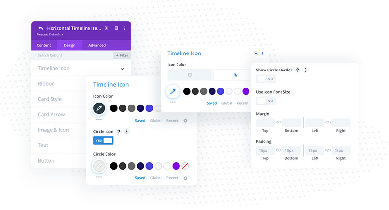
In each child module, in the Design tab, we will find options for customizing timeline icon, ribbon, card style, card arrow, image & icon and button. The settings available in the child module will only apply to the specific card.
Timeline Icon
Each timeline card can have its own icon. Once we select the icon, we can customize it in Design → Timeline Icon. We can select icon color, make the icon circle, change the circle icon background, and adjust timeline icon font size and spacing. To customize the active timeline icon we need to enable the hover option.
Ribbon
We can add a ribbon to each card. It could be a date or any other text we want to be displayed along with the card. Ribbon text can be customized for each card separately in child module settings (Design → Ribbon). We can set the ribbon background color, add a border, adjust ribbon spacing and add box-shadow.
Card Style
If we want each card to have a different style, we can customize the card appearance in child module settings (Design → Card Style). We can set the card border, and add a box shadow.
Card Arrow
If we haven’t customized the card arrow globally and want to use a different arrow style for each card, we can do it in child module settings too (Design → Card Arrow). Once Custom Styling for Card Arrow is enabled, we can customize card arrow size and color.
Image & Icon
Image & Icon settings are available in each child module. We can customize here the appearance of the icon or image added to the card. We change icon color, make the icon circle, adjust icon spacing, and set icon alignment. If we use the image, we can also customize it here.