Table of Contents
The Table of Contents module is a valuable asset frequently utilized on content-rich websites, mainly for substantial articles, blog posts, or comprehensive documentation. Its core purpose is to provide users with an intuitive tool to navigate diverse sections or headings within extensive content efficiently.
Content
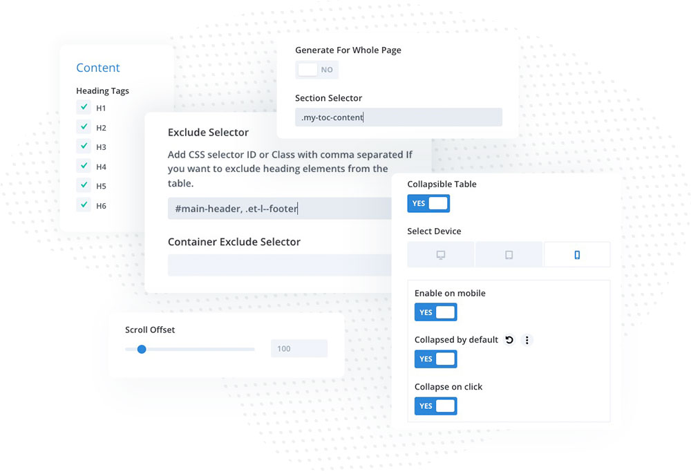
The Table of Contents module allows you to create navigation based on the heading tags. In the Content toggle, you can select what headings should be included. You can generate a Table of Contents for the whole page, or specific sections/rows by adding a custom selector.
The Collapsible Table option allows you to collapse the table, so users must click on it to expand all content. This option is responsive and can be enabled/disabled for specific devices. If you use Divi’s sticky options (Advanced/Scroll Effects/Stick to Top) to make the TOC module sticky on your page, it’s a good idea to collapse the table on mobiles, so it doesn’t cover the content. When this option is enabled, you can also collapse the table by default, and collapse the table after the heading is clicked.
The Generate for Whole Page option is enabled by default. It generates the TOC content for all selected headings from the whole page. By adding CSS ID or Classes to the Exclude Selector field, you can exclude the header, footer, and any other sections or rows you don’t want to be considered in the TOC module content.
You can manually define the section selector by disabling the Generate for Whole Page option. In that case, you need to add a custom class or ID to the section or row with your content, and then add it to the Section Selector field in the TOC module.
The Scroll Offset setting allows you to adjust the scrolling position.

Header Settings
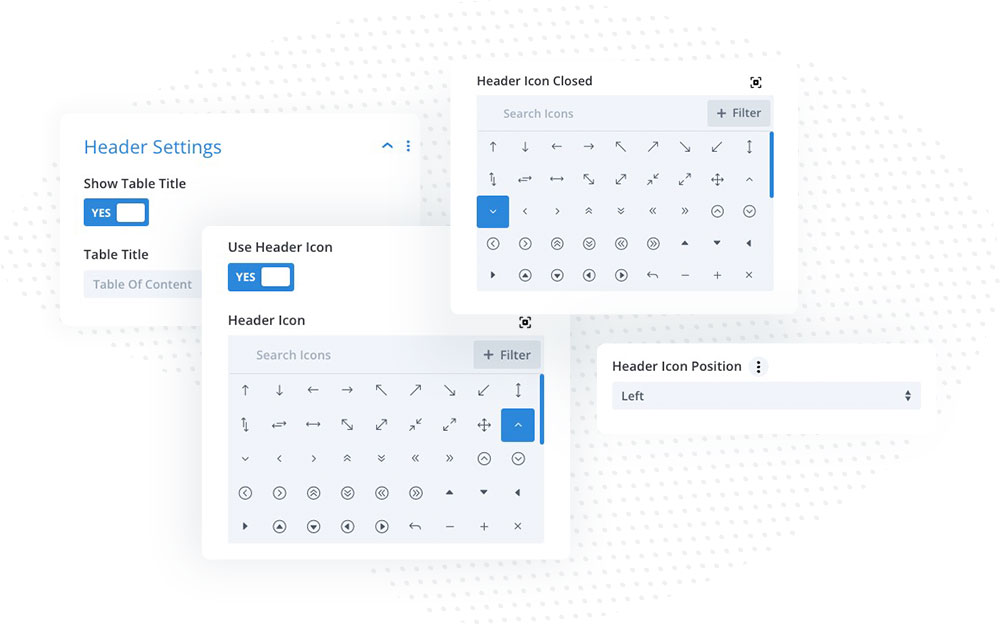
The Table of Contents module allows you to add a table header to display the title with the icon. The header element must be enabled when using the Collapsed Table option, as this is the clickable element that will expand/collapse the module after it’s clicked. You can select the default icon and the icon displayed when the TOC module is collapsed. You can also set the icon position (Left or Right).

Content Settings
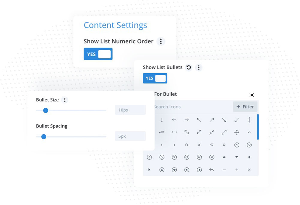
In the Content Settings, you can select whether or not to display Numeric List and/or enable List Bullets. When the List Bullets option is enabled, it allows you to choose the icon you want to use, and define bullets size and spacing.

Design
Alongside the standard customization options provided in Divi modules, the Table of Contents module offers five additional toggles dedicated to styling the header icon, table title, and font styles.
In the Design → Header Icon Style toggle, you can customize the appearance of the header icon, ensuring it aligns harmoniously with your overall design scheme. You can change the icon size, colors, padding, border, and box shadow.
The Table Title toggle allows you to customize the module title. In this toggle, you can control spacing, add background color, select the title H tag, and change font and color.
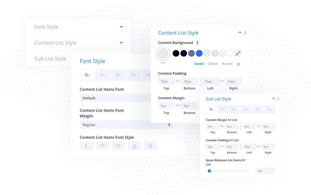
Font Style, Content List Style, and Sub List Style toggles provide customization settings for the table content text.
