Carousel
With Divi Pixel you can easily create beautiful carousel sections in Divi. You can use the default elements, like Icons, Title Text, Descriptions, and Buttons, or you can select Divi Library items to be displayed in the carousel module. This creates virtually unlimited possibilities. In other words, with the Pixel Carousel module you can slide anything!
Content
In the (main) parent module, you can add carousel elements.
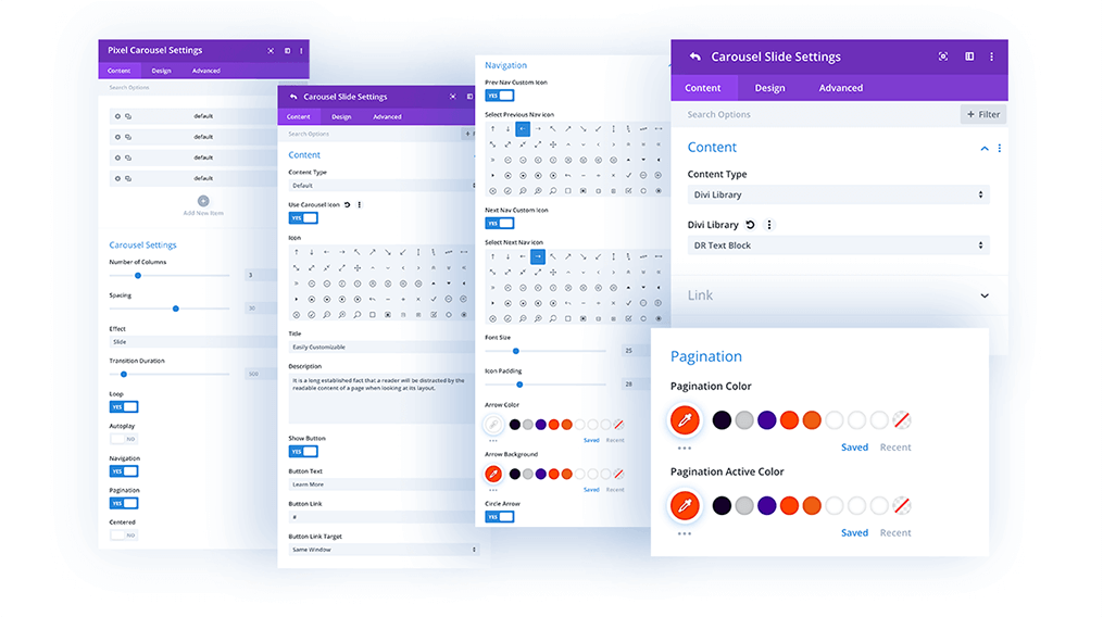
Content → Carousel Settings
Carousel Settings allow you to tweak the Number of Columns, Spacing between carousel items, and select effect (Slide/Coverflow).
You can also enable Loop, Autoplay, Navigation, and Pagination, and center the slider. All of these elements can be customized in the Design tab.
Design → Carousel Text
If you use the default item, you can customize the Title Text and the Description Text in the Design/Carousel Text tab.
Design → Carousel Item
In this section, you can customize the Carousel Item’s appearance, and tweak borders and box shadows globally.
Design → Navigation
Here you can customize the navigation by changing the Next and Prev icons, size, spacing, and color.
Design → Pagination
Here you can customize the pagination navigation position, and color.
Design → Button
If you use the default layout and add buttons, you can customize the button style here.
Content → Content (child module)
Once you add modules to the carousel, you can select if they should be the default items (with icon, title, description and button) or Divi Library Items.
If the Divi Library Item is selected, you can upload any Divi Library item saved to the Divi Library, and display it in the Carousel module.