Filterable Gallery
Add stunning image galleries to your Divi website with the Divi Pixel Filterable Gallery module. Filter images based on their category, and enable overlay settings to display icons, titles and captions on mouseover.
Image Categories
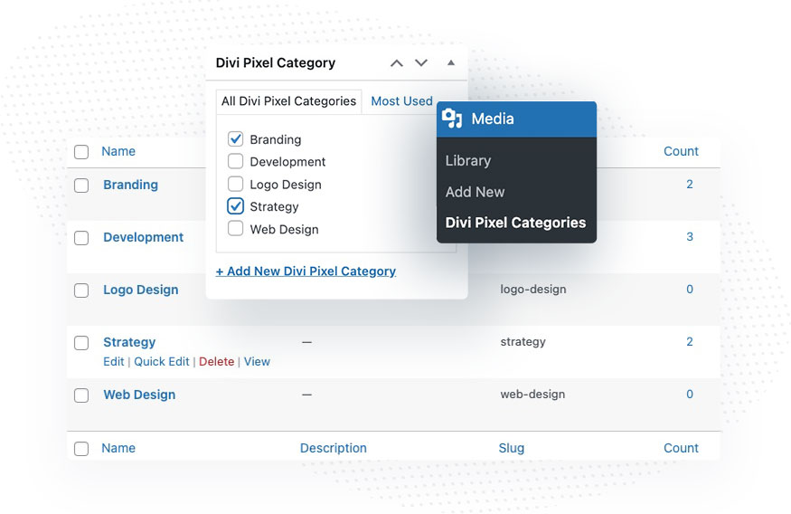
The Filterable Gallery module adds a new taxonomy to the WordPress Media Library. Thanks to the new taxonomy, we can add categories in the media library and assign individual images to categories, which will allow them to be filtered. Images can not only be assigned to specific categories. We can also add an image title, caption and link if we want the image to open a new page after clicking.
Managing Categories
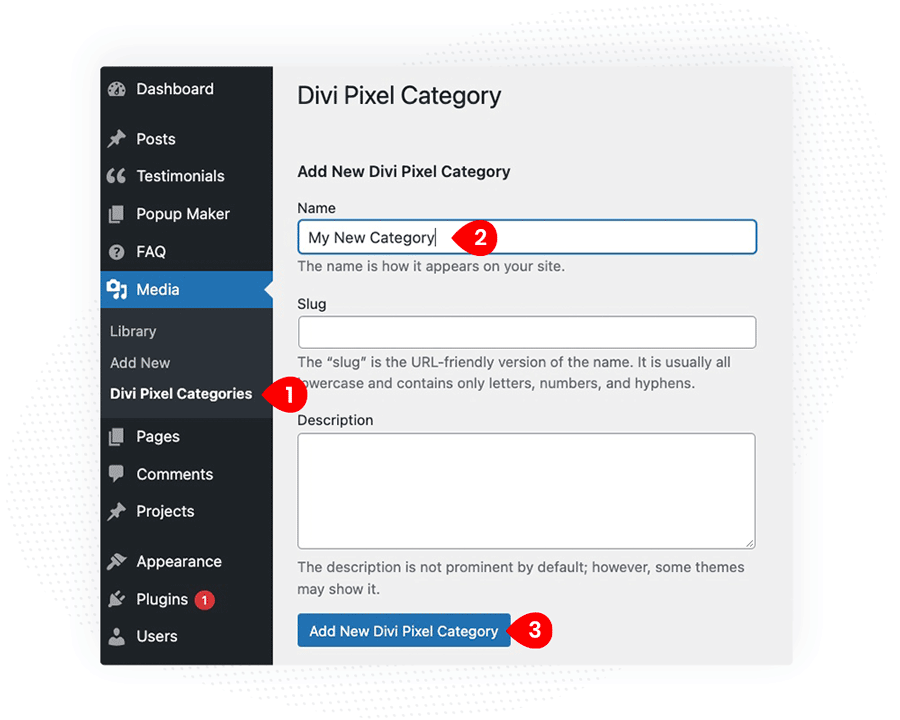
Categories can be managed in the WordPress Dashboard, in the Media Library tab.
- Go to WordPress Dashboard and navigate to Media → Divi Pixel Categories
- Add a new category name
- Click Add New Divi Pixel Category
Assigning Categories
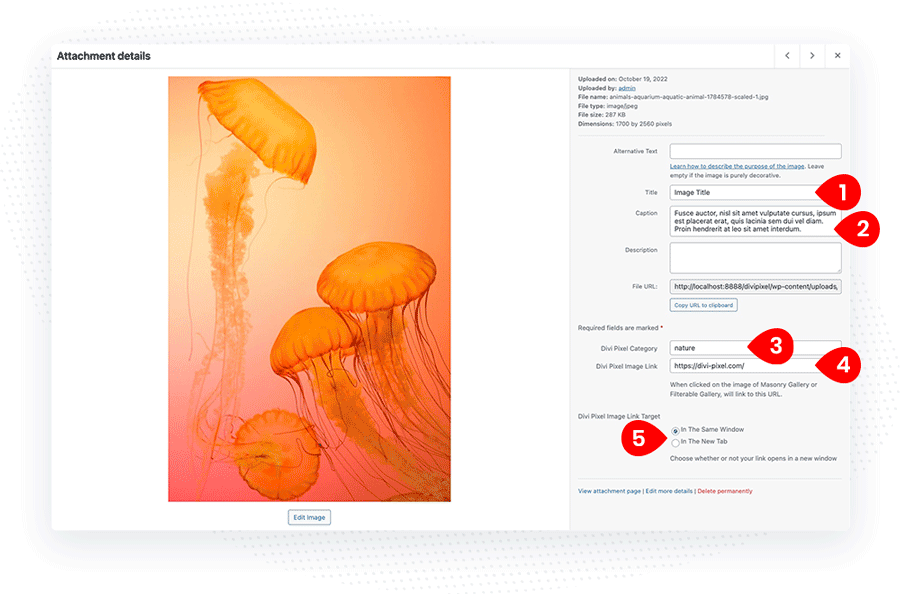
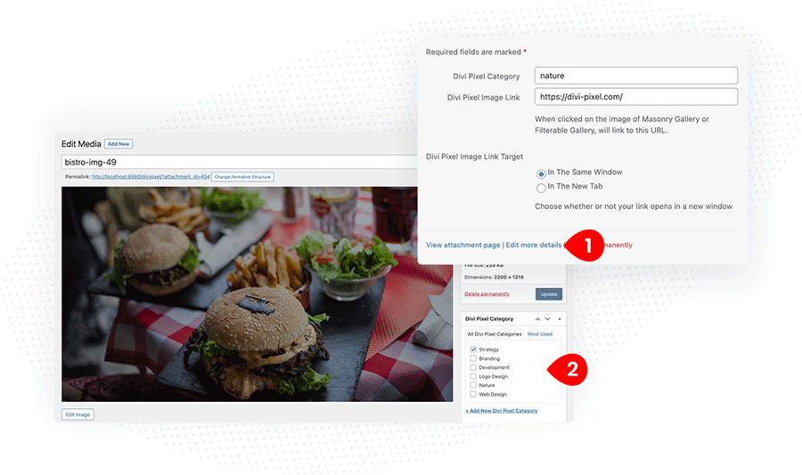
We can assign category to every image uploaded to the WordPress Media Library. When we view image details
- Add Image Title (optional)
- Add Image Caption (optional)
- Add Divi Pixel Category
- Add Image Link (if you want link users to another page when image/link icon is clicked)
- Select Image Link Target (optional)
Another method to assign/unassign a category from the specific image is available when we click the Edit more details link on the image page. On the single image details page we can assign category, edit image title, caption and add image link if needed.
Content Settings
The Content tab in the Filterable Gallery module has 6 new toggles, where we can select categories for the gallery, control Filter Bar settings, grid layout, image overlay and more.
Filter Settings
In the Filter Settings toggle, we can select image categories that will be displayed within the module. We can also set the image count for specific devices and gallery images order. The Image Count setting is responsive, so we can define individually how many images will be displayed on desktop, tablet and mobile.
Filter Bar
To customize the filter bar layout go to the Content Filter Bar toggle. Here you can change the filter bar alignment and layout from Inline to Stacked. The stacked option will play well on mobile devices. We can also choose to display or hide the “All” filter and show the number of images beside the filter name (category).
Grid
Grid toggle is one of the most important settings we need to customize to make our gallery look good on all devices. We have 2 layout options: Masonry and Grid. The Grid option offers also a Row Height setting. Make sure to set Columns, Row Height (if the Grid option is used), and gutter for all devices (desktop, tablet and mobile).
Apart from the layout and grid settings, we can define Grid Animation, and enable the Fix Lazy Loading Images option. This setting should be enabled if we are using Lazy Load plugins and see layout issues using the module.
Grid Items
We can display images, categories, titles and captions in the Filterable Gallery grid. There 7 built-in animations that can be added to the image when users mouse over. To add animation to the image go to Content → Grid Items, and select Image Animation (optionally you can change the animation speed).
Images
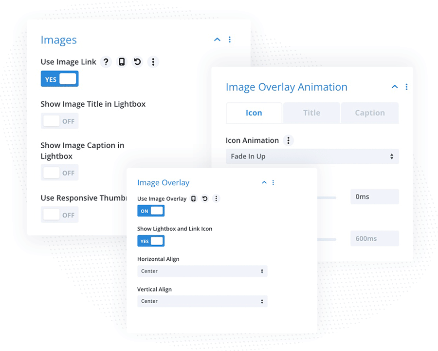
The Images toggle allows us to control how the image will interact after it’s clicked. We can enable Image Link and/or Image Lightbox. If we want our image to display both, we need to enable Use Image Overlay and Show Lightbox and Link Icon in the Content → Image Ovelay toggle.
Image Overlay
The Filterable Gallery module offers powerful settings in terms of displaying overlays on images. We can create stunning hover effects by adding icons, image titles and captions, that will be displayed with a smooth animation when the user mouseovers. To start customizing the overlay we need to enable the Use Image Overlay setting in the Content → Image Overlay toggle.
Image Overlay Animation
The Divi Pixel Filterable Gallery module gives even more control over the hover animations. By customizing animation for each element individually, we can create unique hover effects that will engage visitors and create an unforgettable experience.
To customize overlay animation go to Content → Image Overlay Animation toggle, which is divided into 3 tabs: Icon, Title and Caption. Here we can select animation, delay and speed for each overlay element individually.
Design Settings
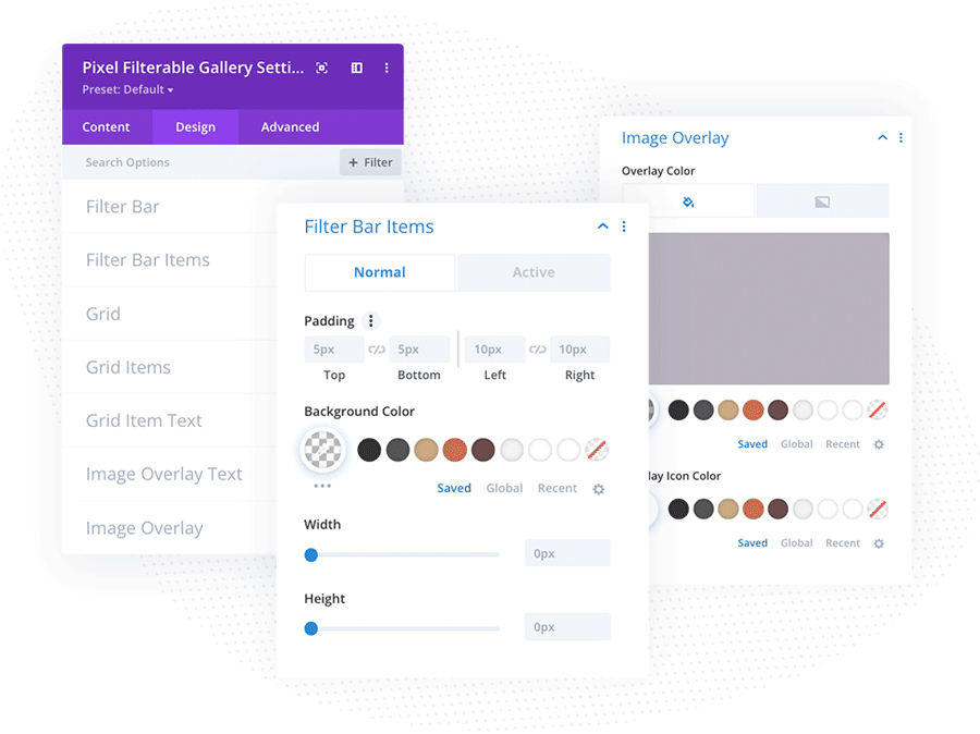
In the Design tab, we can customize the appearance of the filter bar, grid and overlay items. The top 7 toggles in the Design tab are dedicated to the Filterable Gallery module.
Filter Bar
Filter Bar settings allow us to customize the filter bar as a whole part. The settings selected here will apply to the whole filter bar as a container. We can change Space Between Tabs, control filter bar spacing, background color, border and box shadow.
Filter Bar Items
Here we can customize filter bar items (categories) individually. This toggle is divided into 2 tabs: Normal and Active. In the Normal tab, we can customize the appearance of the not active tab. We can control padding, set tab background, width and height (optionally), customize text, and border and add box-shadow.
Grid
In Grid toggle we can control grid spacing, enable grid overflow, add backgournd color, border and box shadow. The settings will apply to the whole grid with gallery images.
Grid Items
Grid Items toggle allows us to customize the single grid item appearance. In this toggle we can add grid item background color, border and box shadow.
Grid Item Text
The Filterable Gallery module allows us to add title, caption and category text and display them in the grid layout, below the image. To customize those text styles, go to the Design → Grid Item Text toggle. Here we can customize spacing and text style for all grid text elements enabled.
Image Overlay Text
The Filterable Gallery module allows also to display icons, title and captions in the image overlay. To customize title and caption displayed on the image overlay go to Design → Image Overlay Text.
Image Overlay
In Design → Image Overlay we can add Overlay Color for default, and hover state and customize overlay icon colors and style.
Custom CSS
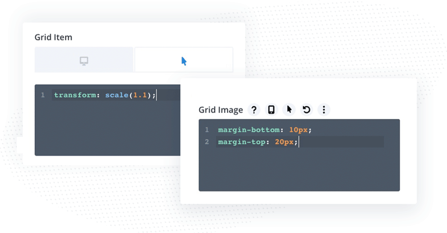
The Filterable Gallery comes with Custom CSS field, where we can add even more styling using custopm CSS Code. These settings will be useful for more advanced users, who want to add some cool hover effects using custom CSS. Note: we can enable Hover state to add CSS that will apply only on hover. There are 5 custom CSS fields available:
Grid Item – the styles added here will apply to the single grid item
Grid Image – the styles added to this field will apply to the single image in the grid
Overlay Icon – add custom CSS to the Overlay Icon
Overlay Title – add custom CSS to the Overlay Title
Overlay Caption – add custom CSS to the Overlay Caption text.
