Image Hotspot
The Image Hotspot module allows for easily creating an interactive image. You can select a background image, and place multiple hotspots on it, such that on hover, a tooltip box appears with additional details. You can use default items for the tooltip box, or Divi Library items. Default item features include image/icon, title, description, and button, and each of these elements is fully customizable.
Content
In the main Content tab you can add price list items as a child modules.
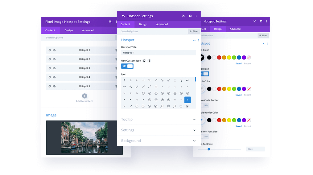
Hotspot Settings → Content → Hotspot
Each hotspot has separate settings. In the Hotspot tab, you can add the hotspot label and choose an icon or image.
Hotspot Settings → Content → Tooltip
In this section you can choose to display default tooltip elements or Divi Library items. If you select Default Content Type, you can add tooltip images or icons, titles, descriptions, and buttons.
Hotspot Settings → Settings
In this section you will find the following positioning and sizing settings:
Hotspot Position Vertical
Hotspot Position Horizontal
Tooltip Position – Left, Right, Top, Bottom
Tooltip Width
Tooltip Content Alignment
Use Tooltip Arrow
Hotspot Settings → Design → Hotspot
In this tab you can customize the tooltip icon or image by making it circular, adding borders and shadows, changing the colors, and selecting the hotspot icon/image size.
Hotspot Settings → Design → Hotspot Ripple Effect
To make hotspots even more interactive, we’ve added a Ripple Effect, which can be enabled or disabled. If enabled, you can control the pulsing effect color.
Hotspot Settings → Design → Tooltip Image
This section allows you to customize the tooltip image. You can define the image size, add rounded corners, borders, and image shadows.
Hotspot Settings → Design → Tooltip Box
In this tab, you can customize the tooltip box appearance and change the background color, add tooltip box padding, rounded corners, borders, and box shadows.
Hotspot Settings → Design → Tooltip Text
In this tab you can customize the Tooltip text: title and description.
Hotspot Settings → Design → Tooltip Button
By enabling this button in the tooltip, you can customize it in the Tooltip Button section, where all the default Divi button customization options are available.