Image Slider
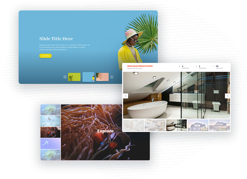
Add a beautiful Image Slider to your Divi website. This module is highly customizable and can be even used for fullwidth hero sliders! Add title, description and button for each image and customize all elements with a bunch of the powerful settings available in this module. Change thumbnails navigation style, position, add arrow navigation, image overlay and more! Create amazing image galleries with the Divi Pixel Image Slider module.
The Divi Pixel Image Slider module offers powerful settings which can help you display your galleries in an engaging and beautiful way. This module is a great addition to any website where images play a big role.

Content Settings
In the Content tab, we can upload images. There are also 2 toggles for Thumbnails Carousel and Main Image Carousel. This is where we can configure our thumbnails carousel and Main Image Carousel navigation and animation.
Thumbs Carousel
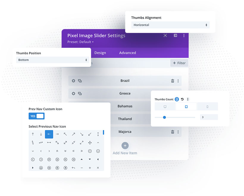
Thumbs Alignment
Select thumbs alignment. We can select vertical or horizontal alignment. When vertical alignment is selected, thumbnails navigation will be displayed vertically at the bottom/centre or top.
Thumbs Count
This control allows us to define how many thumbnails will be displayed on desktop, tablet and mobile.
Space Between Thumbs
Define space between thumbs on all devices.
Thumbs Width
This option allows us to configure thumbnails container width.
Thumbs Height
Define the height of the thumbnails navigation.
Thumbs Vertical/Horizontal Placement
Depending on Thumbs Alignment selected, we can display our thumbs at the top/centre/bottom or left/centre/right.
Float Thumbs Over Main Image
Enable this option to place the thumbs over the image. When this option is enabled we can also select the horizontal and vertical placement of the floating thumbnails navigation.
Navigation
Enable this option to display navigation for thumbnails
Show Navigation on Hover
Enable this option to show navigation on mouseover only.
Centered
By default, the active thumbnail is the first thumbnail in the row/column. By enabling this option, we can make the active (highlighted) thumbnail centered.
Main Carousel
In the Main Carousel toggle we can enable navigation and select 1 of 4 predefined animations for the Main Image Slider.
Enable Navigation on Main Image
Enable this setting to display navigation on the Main Image Slider
Show Navigation on Hover
When Navigation for the Main Image Slider is enabled, we can also show it on hover only.
Animation
The Divi Pixel Image SLider comes with 4 animations. We can select Slide/Fade/Flip and Cube.

Design Settings
Navigation Customization
In the Design tab, we can find 2 toggles for navigation customization (Thumbs Navigation and Main Image Navigation). Both these toggles have the same settings but one is for Thumbnails Navigation and the other for Main Image Navigation.
Prev Nav Custom Icon
Enable this option to display a custom icon for the previous navigation.
Next Nav Custom Icon
Enable this setting to display a custom icon for the next navigation
Icon Size
Tweak this setting to adjust navigation icon size.
Icon Padding
Customize this setting to adjust navigation icon padding.
Arrow Color
This setting allows you to change the navigation icon color.
Arrow Background
If you want to display boxed navigation, select background color.
Circle Arrow
Enable this setting to make your navigation circle.
Horizontal Navigation Position
Customize this setting to adjust the horizontal navigation position.
Vertical Navigation Position
Customize this setting to adjust the vertical navigation position.
Sizing
In the sizing tab, we can configure our Image Slider width and height on specific devices. It’s important to set the height for desktop, tablet and mobiles, so our Image Slider will look and perform well on all devices.
Spacing
In the Spacing toggle, we will find the native Divi settings for module margin and padding, but we can also find Thumbs Container Padding. This is where we can control spacing for the Thumbnails Navigation.
Thumbs Style
In this toggle, we can customize the Thumbnails appearance. We can add a border, control border-radius and width, add and customize thumbnails box shadow.
Image Slider Child Module
Each image added to our carousel have its own settings where we can add content, image overlay, customize texts, button and content spacing.
Slide Image
In this toggle, we can add image and Image Alt Text.
Content
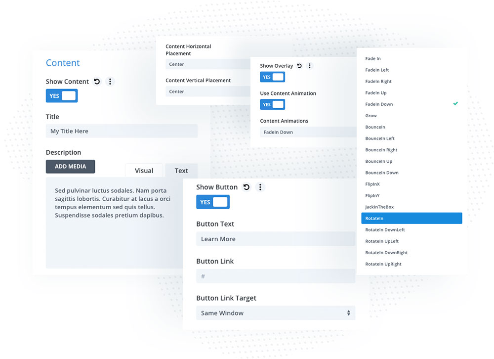
In this toggle, we can enable content for our image and add title, description and button. We can also select Content Horizontal and Vertical placement, button target link, enable Show Overlay settings and select Content Animation.

Image/Content Customization
Each child module (slide image) can be customized in the Design tab.
Content Text
In this toggle, we can customize the slide image title and description.
Content Sizing & Spacing
In this toggle, we can control content spacing and width for all devices.
Image Overlay
In this toggle, we can customize Image Overlay. To use this setting, the Show Overlay option must be enabled in the Slide Image Content toggle.
Text
Here we can change text alignment, theme color (Light/Dark) and add text shadow to our texts.
Content Button
In this toggle, we customize our slider image button when it’s enabled. We can adjust button text style and customize button appearance (colors, border, icon, spacing and box shadow).