Reveal
Incorporating a “Show More” and “Show Less” feature proves invaluable in text-rich websites, particularly those hosting numerous articles on a single page, such as news and magazine websites. This functionality empowers web designers to offer users the flexibility to expand or condense text content based on their preferences and needs.
Content
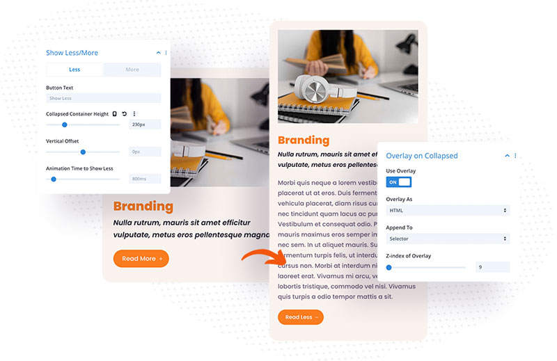
In the Content settings, you will find three custom toggles with the Reveal module option:
- Settings – here you can define the Container Selector by adding CSS Class or ID, change the Default Show Status and change button alignment.
- Show Less/Show More – this toggle is divided to 2 tabs, where you can change Show Less/And Show More button settings.
- Overlay on Collapsed – the Reveal module allows you to add overlay for the collapsed state. You can display overlay as HTML or CSS and append it to the Slelector or Parent of Selector.

Design
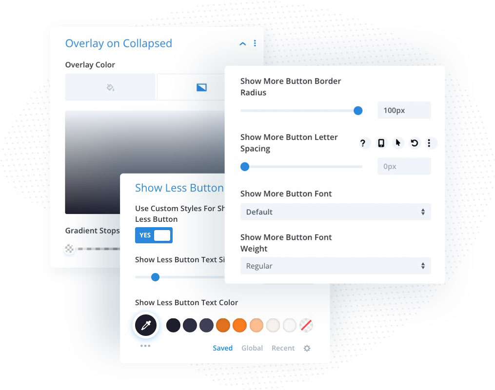
You can customize the Overlay on Collapsed and Show More/Show Less buttons in the Design tab.

Using Reveal Module
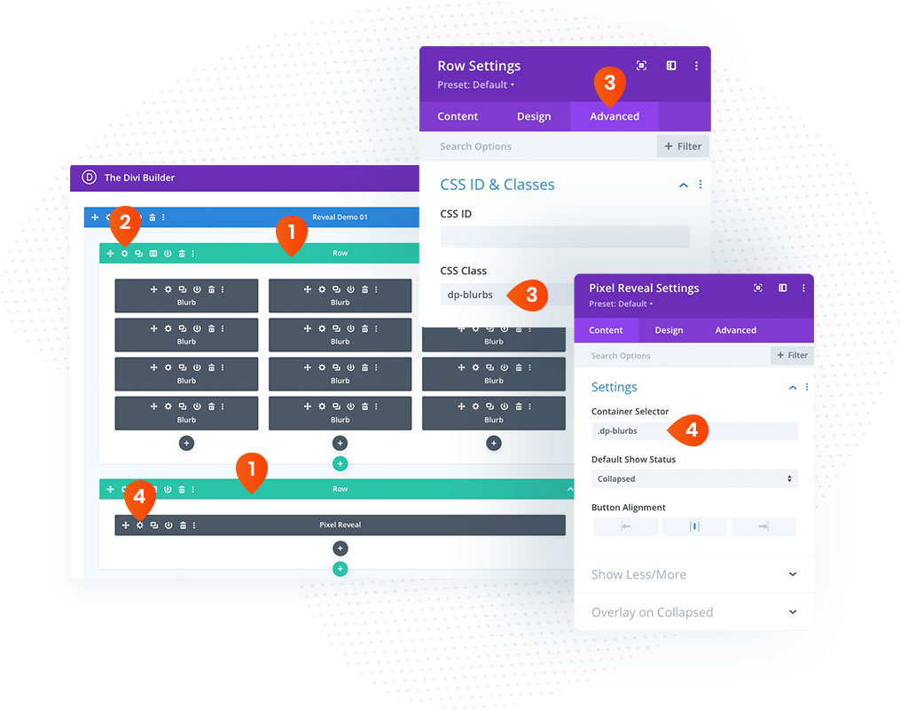
The most important part of the Reveal module is defining selectors in the Reveal module Content Settings and adding this selector to the element that you want to reveal after the button is clicked.
- Add a row with the layout you want to expand/collapse and another row with the Reveal module
- Open the Row settings of your layout
- In the Advanced tab open CSS ID & Classes toggle, and add CSS selector dp-blurbs (or any other class you want)
- Open the Reveal module settings, and add Container Selector .dp-blurbs (or the class you have used)
