Timeline Module
Timelines have always played an important role in websites that want to show the history, a process or something that has a stepwise procedure. The Divi Pixel Timeline module lets you create beautiful timelines on your website using the Divi Builder. This timeline module works similar to other Divi Pixel modules; you just need to add the module to your page and format it as per your requirements.

Content
Timeline module allows you to add as many timeline items as you want. Each item added has it’s own settings, so you can customize all items individually, or create and customize one item and then duplicate it to keep the same styling.
Card Arrow
In parent module settings we can add an arrow, that will be displayed on our card and point to the timeline icon. This arrow can be customized individually for each card in child module settings (Design/Card Arrow).
Layout
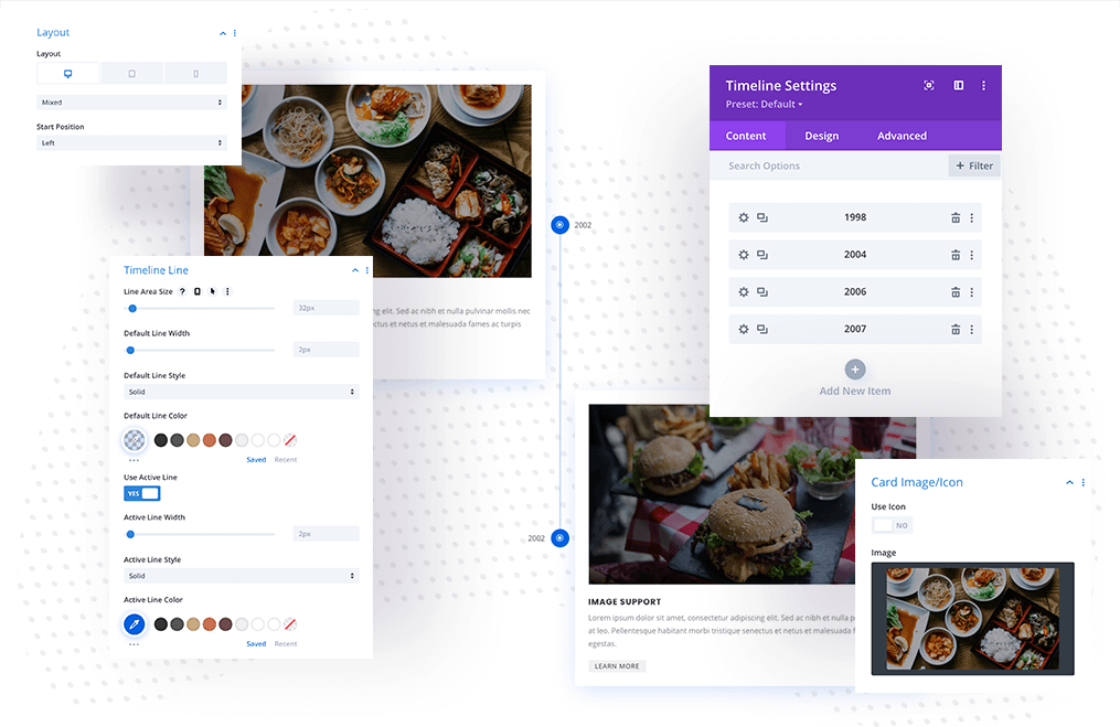
Parent module also offers Layout settings. We can select Mixed, Left or Right layout. If Mixed layout is selected, we can also define on which side our first card should appear (Left/Right). These settings are responsive, which means we can customize layout individually for desktop, tablet and mobile view.
Timeline Line
Our Timeline Line can be also customized in the parent module (Design/Timeline Line). Here we can find multiple settings which allow us to customize line width, color, style and Line Area Size, which will help us to set the proper spacing of the cards according to the Timeline Icon size defined.
Child / Card Text
In this section we can add Ribbon (year/date), Title, Description and enable Button.
Child / Card Image & Icon
We can also add Image or Icon to our card and customize it further in Design tab. If we want to display Image, then we can also add Alt Image Text for SEO purposes.
Child / Timeline Icon
Each card can have an icon added, that will be displayed on our timeline. In this section, we can select the icon for the individual card. This icon can be customized in the Design tab.
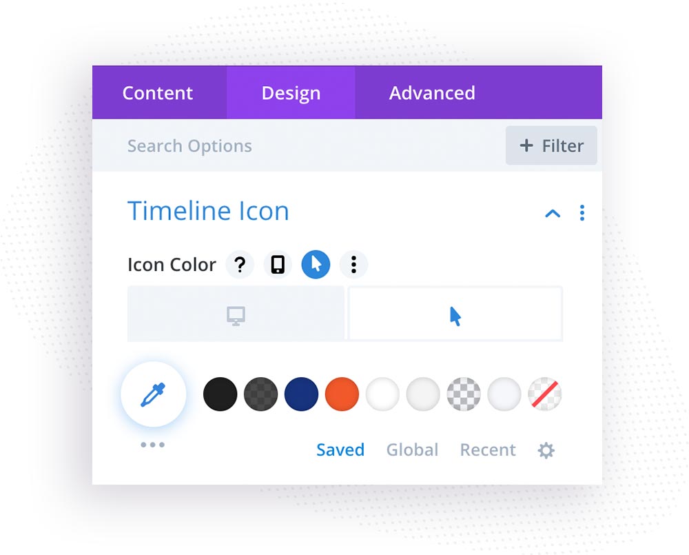
We can also set the active icon color and background by editing hover settings.

Child / Design
In the design section, we can customize the look of our card. We will find multiple tabs here:
• Timeline Icon – icon color, circle icon, icon size
• Card Style – border-radius, border style, width, Box Shadow
• Card Arrow – arrow size and color
• Image/Icon – icon alignment, border radius, border width, style, color, box-shadow, filters
• Text – this is where timeline card texts can be customized
• Button – we can enabled custom style for button
• Sizing – define card size
• Spacing – here we can customize card spacing, add card margin/padding and tweak card content padding as well