
Conversation
Meet the Pixel Conversation module for Divi! Tell your story as a real chat. Build message threads that look like popular messaging apps, with bubbles, avatars, timestamps, read receipts and emoji reactions, and have them play out message by message with a typing indicator as visitors scroll to them. It works well for testimonials, product walkthroughs, support showcases and landing-page storytelling.
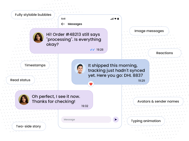
With the Pixel Conversation module you can:
- Build a chat from individual messages, each on the incoming (left) or outgoing (right) side
- Pick a chat style: iOS and Material draw the chat inside a phone mockup, and the Messenger styles show only the messages
- Send text, images (a single photo or a photo group) and stickers
- Add avatars, sender names, timestamps, read status and emoji reactions
- Play the conversation with a typing indicator once the module scrolls into view
- Preview the playback directly in the Visual Builder
How the module works
The Pixel Conversation is a parent/child module. The parent module holds the chat as a whole: the chat style, what is shown for every message, and the typing simulation. Each child item is one message. Messages play in the order they appear in the builder, so drag them to reorder the conversation.
How to add the Conversation module
- Open a page with the Divi Visual Builder
- Click the + (Add New Module) button
- Search for Pixel Conversation and click it to insert the module
- Add a child message for every line of the chat and set its Bubble Direction
- Click Play Conversation in the module settings to preview the playback
Conversation Settings
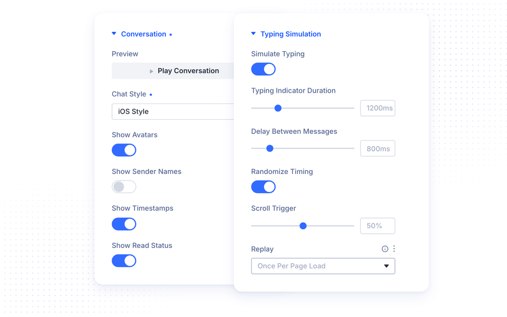
The Conversation group of the parent module sets the look of the whole chat. The Chat Style option picks the messenger look:
- Neutral / Custom is a clean base style for your own colors
- iOS Style and Material Style draw the chat inside a phone mockup, with a status bar, a title bar and a message input
- Green Messenger Style, Blue Messenger Style and Light Messenger Style show the messages on their own, styled after popular messenger apps
- Auto (Follow Device) follows the visitor’s device: Apple devices get the iOS colors, and every other device gets the Material ones
The other options in the group control what each message shows:
- Show Avatars shows the avatar image next to each message (on by default)
- Show Sender Names shows the sender name above each message, like a group chat
- Show Timestamps shows the timestamp of each message (on by default)
- Show Read Status shows the sent, delivered and read indicator (on by default)
- Play Conversation replays the conversation on the canvas, so you can check the timing without leaving the builder. The same action is available from the module’s right-click menu
NOTE: The read status indicator only appears in chat styles that support it. The phone mockup appears only in the iOS Style and Material Style. Auto uses their colors but renders the messages without the phone.
Typing Simulation
The Typing Simulation group controls how the conversation plays:
- Simulate Typing shows a typing indicator before each message appears (on by default). The messages arrive one after another either way. This setting only decides whether the dots run ahead of them
- Typing Indicator Duration sets how long the typing dots stay on screen before a message appears (0–5000ms, default 1200ms)
- Delay Between Messages sets the pause after a message appears before the next one starts (0–5000ms, default 800ms)
- Randomize Timing adds a small random variation to every duration and delay, so the chat feels less mechanical (on by default)
- Scroll Trigger sets how much of the module must be visible before the conversation starts playing (default 50%)
- Replay plays the conversation Once Per Page Load, or Every Time It Enters The Viewport
Messages
Each child item is one message. Its Message group has these settings:
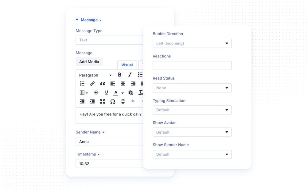
Each child item is one message. The Message Type option in its Message group sets what kind of message it is:
- Text shows a regular chat bubble
- Image shows images inside the bubble. Choose several and they are laid out as a photo group, in the order you set
- Sticker shows a large image with no bubble
The rest of the Message group fills in the message:
- Message is the text of the message. Leave it empty to skip the text
- Images / Stickers holds the images for the Image and Sticker types
- Sender Name is an optional name shown above the bubble, useful for group chats
- Timestamp is free text shown under the bubble, for example 10:34
- Avatar is the image shown next to the message
- Bubble Direction places the message on the Left (Incoming) or Right (Outgoing) side
- Reactions holds emoji characters shown as a reaction badge on the bubble, for example a heart and a thumbs up
- Read Status can be None, Sent, Delivered or Read, shown next to the timestamp
- Typing Simulation is Default (follow the parent), Force On or Force Off for this one message
- Show Avatar / Show Sender Name is Default (follow the parent), Show or Hide for this one message
NOTE: In right-to-left languages the incoming and outgoing sides are mirrored automatically. You don’t need to change the Bubble Direction of your messages.
NOTE: In right-to-left languages the incoming and outgoing sides are mirrored automatically. You don’t need to change the Bubble Direction of your messages.
Design Settings
The parent module styles the chat as a whole:
- Message List sets the spacing of the message area
- Text sets the default typography for the whole conversation
Each message has its own design groups, so single messages can stand out:
- Bubble sets the bubble background, border and spacing, and the Show Bubble Tail toggle adds or removes the small pointer on the bubble
- Message Text sets the typography of the message
- Sender Name Text / Timestamp Text / Reactions Text set the typography of each meta element
- Avatar Initial styles the letter shown when a message has no avatar image
Accessibility
The Conversation respects the visitor’s reduced motion preference. When the operating system asks for reduced motion, all messages are shown at once without the typing animation.
Advanced Settings
The Advanced tab includes all standard Divi options: CSS ID & Classes, Custom CSS, Conditions, Visibility, Transitions, Position and Scroll Effects. The Custom CSS section has dedicated fields for the Conversation, Message List, Message, Bubble, Avatar, Timestamp, Reactions and Typing Indicator. Each message adds fields for its own Message Text, Sender Name, Image / Sticker and Avatar & Bubble Row.
Design Ideas
- Product walkthrough in a phone uses iOS Style, a customer asking questions on the left and your brand answering on the right, with Replay set to Every Time It Enters The Viewport.
- Testimonial chat uses the Green Messenger Style, customer avatars, a final heart reaction and Read status on your last reply.
- Group chat story turns on Show Sender Names, gives each participant their own avatar and adds a Sticker message for a playful ending.
- Instant support demo keeps typing on for the answers but uses Force Off on the visitor’s questions, so replies feel typed and questions appear at once.