
Card Stack
Meet the Pixel Card Stack module for Divi! Turn any set of content cards into a scroll-driven stack — as visitors scroll, each card glides in and lands on top of the previous one, pushing the covered cards back with tilt, scale, fade and blur effects. A striking way to present features, process steps, case studies or pricing plans one card at a time.
With the Pixel Card Stack module you can:
- Build every card from a regular Divi Group — so each card can hold any modules you like
- Stack the cards in place while the page pauses, or lay them out in a column where each card sticks as the next one scrolls in
- Control where cards enter from and where covered cards are pushed to — any angle, 0–360°
- Shape both animations with tilt, scale, fade and blur per card position
- Enable Auto Scroll, so every wheel turn or swipe plays the animation to the next card on its own
- Keep the stack clear of your header with Top Offset and automatic Detect Menu
How the module works
The Card Stack is a container module: every card is a Divi Group placed inside it. When you add a new Card Stack, it comes prefilled with four ready-made Group cards — each with its own background color, a box shadow and a Call To Action — so you can see the effect immediately and replace the content with your own.
As the page scrolls, the waiting cards (the Entry Animation) move towards the stack one by one. When a card lands, it pushes the cards underneath it one step away (the Exit Animation) — they tilt, shrink and eventually fade out once more cards than Visible Cards are on the stack.
How to add the Card Stack module
- Open a page with the Divi Visual Builder
- Click the + (Add New Module) button
- Search for Pixel Card Stack and click it to insert the module
- Edit the four prefilled Group cards, or add more Groups for additional cards
- Fine-tune the behavior in Design → Card Stack
Cards
Each card is a standard Divi Group — style it with the Group’s own design settings (background, spacing, border, box shadow) and fill it with any modules: headings, text, images, buttons, icons and more. Reorder the cards by dragging the Groups in the builder or in the module’s Elements list; the stack plays them in that order.
Card Stack Settings
All behavior lives in the Card Stack group of the Design tab.
Layout
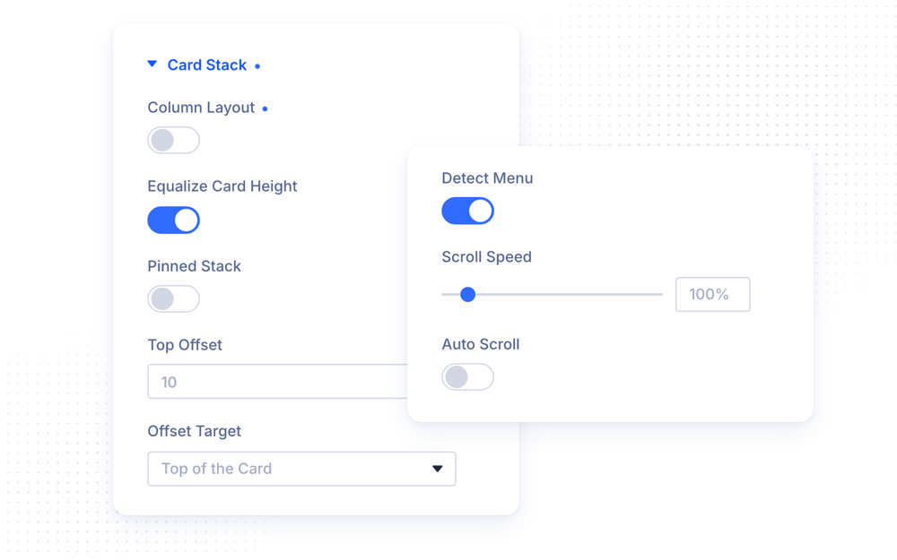
- Column Layout — On (default): the cards are laid out in one column and each card sticks at the Top Offset as the next one scrolls in, so the module is as tall as all cards together. Off: the module is only as tall as its tallest card, and the page pauses while the cards land on the stack
- Equalize Card Height — give every card the height of the tallest card (on by default)
- Pinned Stack — Off: a landing card rests at the Top Offset line and pushes the cards under it away along the Exit Direction. On: the first card keeps its top edge on the line for good, and every further card lands one Card Distance further against the Exit Direction, so the stack grows outward from the line
- Top Offset — space between the top of the visible page and the top edge of the module box, where the cards pin (defaults to 10vh)
- Offset Target — whether the Top Offset line applies to the Top of the Card (the resting card) or the Top of the Stack (the top-most pushed card). Not shown with Pinned Stack, which reserves its own room
- Detect Menu — measure a fixed or sticky menu at the top of the page and add its height to the Top Offset, so the cards pin below it (on by default)
NOTE: The WordPress admin bar is always added on top of the Top Offset. With Detect Menu enabled, your fixed or sticky header is added too — so the cards never slide under your navigation.
Scroll
- Scroll Speed — how fast the cards move (10–300%, default 100%). Without Auto Scroll, 50% takes twice as much scrolling for the whole animation, 200% half as much. With Auto Scroll, it sets how fast each card glides in
- Auto Scroll — the page stops when it reaches the stack, with the first card in place. From there, every scroll gesture — a wheel turn, a swipe or a key press — plays the animation all the way to the next card on its own. After the last card, the next scroll continues down the page. In Column Layout, the page itself glides from one card to the next
Entry Animation
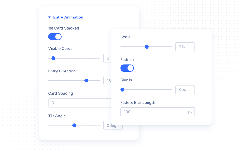
The Entry Animation controls the waiting cards before they land:
- 1st Card Stacked — the first card starts in its resting position (on by default); turn off to let it enter with the animation like every other card
- Visible Cards — how many cards are visible before the scroll starts, counting the stacked one (default 3)
- Entry Direction — where the cards come from: 0° from above, 90° from the right, 180° from below (default), 270° from the left
- Card Spacing — the gap between waiting cards (default 5vh); 0 makes them touch, negative values overlap them
- Tilt Angle / Tilt Pivot — rotation per queue position and the point the cards rotate around; a card straightens out as it lands
- Scale — size change per queue position (default 2%)
- Fade In / Blur In — cards beyond Visible Cards fade in and/or sharpen from a blur, over the Fade & Blur Length scroll distance
NOTE: In Column Layout the cards always flow in from below with the first card in place, so Entry Direction and 1st Card Stacked are hidden there.
Exit Animation
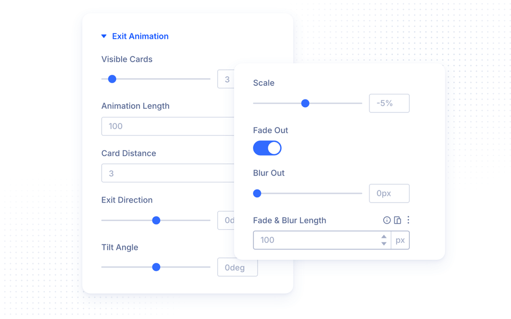
The Exit Animation controls the covered cards on the stack:
- Visible Cards — how many cards stay visible on the stack (default 3); every further card pushes the oldest one off
- Animation Length — the scroll distance over which a landing card pushes the stack into its next position; longer is smoother
- Card Distance — the offset between stacked cards along the exit direction (default 3vh)
- Exit Direction — where the covered cards are pushed: 0° up (default), 90° right, 180° down, 270° left
- Tilt Angle / Tilt Pivot — rotation added for every card that lands on top
- Scale — size change for every card on top (default −5%, so covered cards shrink)
- Fade Out / Blur Out — a card pushed off the stack fades out and/or blurs over the Fade & Blur Length
Accessibility
The Card Stack respects the visitor’s reduced motion preference: when the operating system asks for reduced motion, the stack animation is not played and the cards stay in their regular layout.
Advanced Settings
The Advanced tab includes all standard Divi options — CSS ID & Classes, Custom CSS, Conditions, Visibility, Transitions, Position and Scroll Effects. The Custom CSS section exposes dedicated fields for the Cards Container and each Card.
Design Ideas
- Feature deck — Column Layout off, Entry Direction 180°, Exit Direction 0° with −5% scale: cards rise from below and push the previous ones up into a neat pile.
- Fanned stack — Exit Tilt Angle 4° with the pivot at the bottom-left corner, so covered cards fan out like a hand of cards.
- Guided story — Auto Scroll on at 80% Scroll Speed: every scroll gesture reveals exactly one step of your process.
- Side entry — Entry Direction 90° with Blur In 8px: cards slide in from the right and sharpen as they land.