
Meet the Pixel WhatsApp Chat module for Divi! Let visitors start a WhatsApp conversation with your business in one click. Add a floating chat button to any corner of the screen, or an inline button anywhere in your layout. Open a chat box with a greeting and a short form, or send visitors straight to WhatsApp. Add your whole team as agents, each with their own number, photo and working hours. It works without any API, account or external script, so nothing is loaded from WhatsApp and nothing is tracked.
With the Pixel WhatsApp Chat module you can:
- Show a floating button in a corner of the screen, or an inline button in your layout
- Open a chat box with a greeting and a form, or open WhatsApp directly
- Add several agents, so visitors can pick the right person from a list
- Set available hours per agent, with an online status dot and an offline message
- Collect a name, topic and message and pre-fill them into the WhatsApp message
- Show a notification badge and open the chat box automatically after a delay
- Style every part of the button, chat box, agent list and form in the Design tab
How the module works
The Pixel WhatsApp Chat is a parent/child module. The parent module is the widget itself: the button, where it sits, what happens on click, and the chat box. Each child item is one agent: a person or team with their own WhatsApp number, photo, available hours and chat form.
The number of agents changes how the chat box works:
- With one agent, clicking the button opens that agent’s chat window
- With two or more agents, clicking the button opens a list of agents first. The visitor picks one, and a back button returns to the list
An agent without a usable WhatsApp number is not shown on the page. Until at least one agent has a number, the module shows nothing on the frontend, and the Visual Builder shows a hint instead.
How to add the WhatsApp Chat module
- Open a page with the Divi Visual Builder
- Click the + (Add New Module) button
- Search for Pixel WhatsApp Chat and click it to insert the module
- Open the first agent and enter your WhatsApp Number
- Add more agents for every person or team visitors can chat with
NOTE: A floating widget stays fixed to a corner of the screen wherever the module sits, so you can place it in any section. To show it on every page, add it to a Theme Builder footer. In the Visual Builder the module shows a small placeholder where it sits. Click the placeholder or the chat button to open the settings, and the chat box opens with them so you can style it.
Behavior and Placement
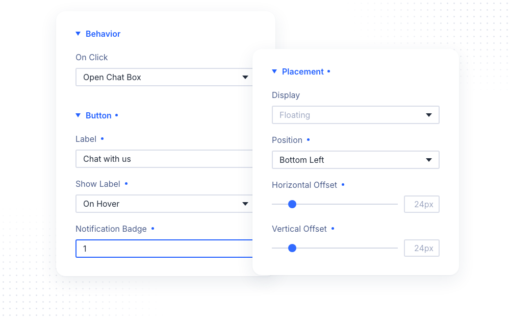
The Behavior group sets what the button does. On Click has two options:
- Open Chat Box opens a chat window with a greeting and the fields you add to each agent. The visitor fills them in and clicks the chat button to continue in WhatsApp
- Open WhatsApp Directly opens WhatsApp right away. With two or more agents, the visitor still picks one from the list first
The Placement group sets where the button appears:
- Display is Floating (fixed to a corner of the screen, taking no room in the layout) or Inline (shown where the module sits)
- Position picks the screen corner of a floating button: Bottom Right, Bottom Left, Top Right or Top Left
- Horizontal Offset and Vertical Offset set the distance of a floating button from the screen edges
- Alignment places an inline button on the left, in the center or on the right of its column
Button
The Button group sets the content of the WhatsApp button:
- Label is the call to action next to the icon, for example “Chat with us”. It is also the button’s name for screen readers
- Show Label shows the label Always, On Hover (the button grows out from the icon) or Never (Icon Only). A hidden label is still read by screen readers
- Notification Badge is a short text in a badge on the button, for example “1”. It disappears once the visitor has opened the chat box. Leave it empty for no badge
Popup Header and Chat Box
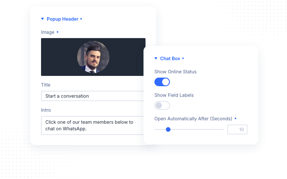
The Popup Header group fills the header of the agent list, shown when the module has two or more agents:
- Image is a logo or photo at the start of the header
- Title is the heading of the list, for example “Start a conversation”
- Intro is a short text under the title
The Chat Box group sets how the chat box behaves:
- Show Online Status adds a dot to each agent’s avatar: green while the agent is available, grey while offline (on by default)
- Show Field Labels shows each form field’s label above it. Hidden labels stay available to screen readers
- Open Automatically After (Seconds) opens the chat box by itself after the set time. It opens once per browser session, and never again after the visitor opened or closed it. 0 turns it off. It never opens automatically in the Visual Builder
Agents
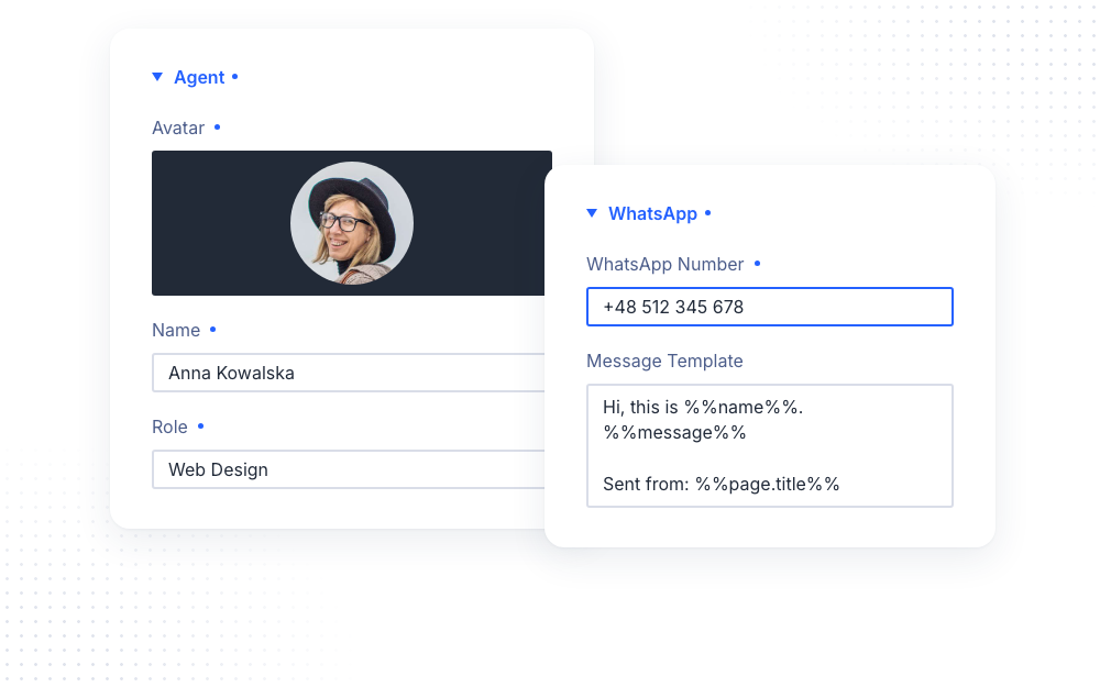
Each child item is one agent. The Agent group sets how the agent appears:
- Avatar is the photo or logo shown in the agent list and in the chat window header
- Name is the name of the person or team, for example “Anna Kowalska”
- Role is a small line shown with the name, for example “Support” or “Typically replies within an hour”
The WhatsApp group connects the agent to WhatsApp:
- WhatsApp Number is the agent’s number with the country code. Any format works: +49 (0) 151 234-567, 0049 151 234567, spaces, dashes and brackets are all cleaned up
- Message Template is the message pre-filled in WhatsApp. Leave it empty to open the chat without a message
The message template can use these placeholders:
- %%name%%, %%topic%% and %%message%% insert what the visitor entered in the agent’s chat form
- %%page.url%% and %%page.title%% insert the page the visitor is on
- %%site.name%% and %%site.url%% insert your site’s name and address
NOTE: A form field that is shown but not placed in the template is still sent, as a “Label: value” line in its form position. For example, a Topic field without %%topic%% is added before the message line. Empty and unknown placeholders are removed, so the same template also works in Open WhatsApp Directly mode, where there is no form.
Availability
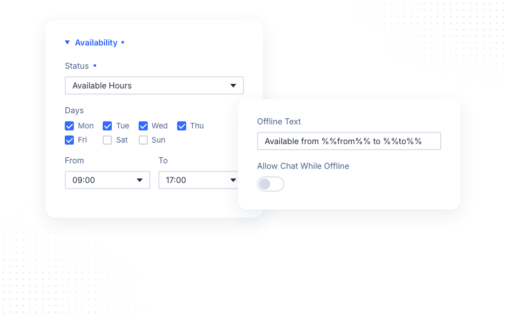
The Availability group sets when an agent can be reached. Status has three options:
- Always Online keeps the agent available at all times (the default)
- Available Hours makes the agent available on the chosen Days, between From and To. A To time earlier than From runs past midnight, for example 22:00 to 06:00
- Offline marks the agent as unavailable, for example during holidays
The other options set what visitors see while an agent is offline:
- Offline Text is shown with the agent while offline. %%from%% and %%to%% insert the available hours, for example “Available from %%from%% to %%to%%”. Leave it empty for none
- Allow Chat While Offline decides whether visitors can still write. When it is off, an offline agent is greyed out and can’t be picked, and its chat button is disabled. When it is on, visitors can still send a message, and the agent answers later
NOTE: Available hours use your site’s timezone, set in WordPress › Settings › General › Timezone. Make sure it matches the timezone your team works in. The status is checked again every minute while the page is open, so it stays correct on cached pages too.
Chat Form
In Open Chat Box mode, each agent has their own chat window. The Chat Form group fills it:
- Greeting is a message shown as a chat bubble from the agent. Line breaks are kept. Leave it empty for no greeting
- Chat Button Text is the text of the button that opens WhatsApp, for example “Start Chat”
Each agent can show up to three form fields, each in its own group:
- Name Field is a single-line field for the visitor’s name (%%name%%), shown by default
- Topic Field is a dropdown of topics (%%topic%%). Add the choices under Options
- Message Field is a multi-line field for the visitor’s message (%%message%%), shown by default
Every field has a Label, a Placeholder (the hint shown inside the empty field, or the first empty entry of the dropdown) and a Required Field toggle. A required field must be filled in before WhatsApp opens. If it is empty, the visitor sees an error message next to it.
Design Settings
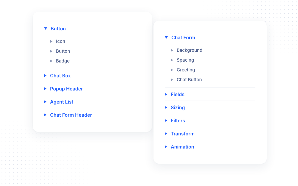
The Design tab groups the settings by part of the widget, so every part is easy to find. Inside each group, related settings sit together in sub-toggles, and some have tabs to switch between the text and the look of an element:
- Button styles the WhatsApp button:
- Icon sets the icon color and size
- Button has a Button Text tab for the label font and spacing, and a Button Style tab for the background, spacing, border and box shadow
- Badge has a Text tab for the badge font and a Style tab for its background, spacing and border
- Chat Box styles the window that opens: background, size, spacing, border and box shadow
- Popup Header styles the header of the agent list: background, spacing, image, title and intro text, and the Close & Back Buttons (icon color and size, background and border)
- Agent List styles the agents in the list:
- Item Style sets the background, spacing, border and box shadow of each agent entry
- Status Dot sets the online color, offline color, size and border of the dot
- The avatar, role, name and availability text each have their own settings
- Chat Form Header styles the header of an agent’s chat window: background, spacing, border, avatar, name and role. With a single agent, the Close & Back Buttons settings appear here too
- Chat Form styles the chat window body:
- Its background and spacing
- Greeting has a Text tab for the greeting font and a Style tab for the bubble’s background, spacing and box shadow
- Chat Button has a Button Text tab for the font and a Button Style tab for the background, spacing, border and box shadow
- Fields styles the form fields, their labels and placeholders
The default look of the widget is already filled in as the default value of each setting, for example the button and chat box shadows, the button and badge colors, the greeting bubble, the chat button, the status dot colors and the field borders. Change any value to restyle that part, or set a box shadow to None or a border width to 0 to remove it.
Toggles are only shown when they apply. The chat window toggles are hidden in Open WhatsApp Directly mode, and the Popup Header and Agent List toggles are hidden while the module has only one agent.
The Filters, Transform and Animation groups apply to the whole widget, the button together with the chat box. Sizing sets the width of the module’s placeholder, and Spacing is available for Inline buttons.
Privacy
The module is GDPR-friendly by design. It uses plain WhatsApp links (wa.me), with no WhatsApp script, API or account, no external requests, no cookies and no tracking. What a visitor types into the chat form never leaves their browser. It only becomes part of the WhatsApp link that opens when they click the chat button.
Accessibility
- The chat box is a proper dialog. Esc and the close buttons close it, and the focus returns to the button
- A hidden label, hidden field labels and the online status are still announced by screen readers
- Errors in required fields are announced, and the focus moves to the first empty required field
- The module respects the visitor’s reduced motion preference, with no hover or opening animation
- On right-to-left sites, the left and right positions and the chat box layout are mirrored automatically
For Developers
The widget fires a dipi-whatsapp-chat-open event whenever WhatsApp is opened. It bubbles up from the widget, and its detail holds the number and the mode (chatbox or link). Use it to track chat starts in your analytics, for example:
document.addEventListener('dipi-whatsapp-chat-open', function (event) { console.log('WhatsApp chat opened', event.detail.mode);});Advanced Settings
The Advanced tab includes all standard Divi options: CSS ID & Classes, Custom CSS, Conditions, Visibility, Transitions, Position and Scroll Effects. The Custom CSS section has dedicated fields for the Button, Label, Chat Box, Greeting, Form Fields, Field Errors, Chat Button and List Item. Each agent adds fields for its own List Item and Chat Window.
Design Ideas
- Support team in a corner uses three agents for Sales, Support and Billing, each with their own available hours, and Allow Chat While Offline turned on, so visitors can always leave a message.
- Booking request uses one agent with the Name and Topic fields required and a template like “Hi, this is %%name%%, I’d like to book: %%topic%%”.
- Product page question uses an Inline button under the add-to-cart area, Open WhatsApp Directly, and a template with %%page.title%%, so you know which product the visitor is asking about.
- Gentle nudge uses a Notification Badge of “1” and Open Automatically After set to 20 seconds, with a friendly greeting from a real team member.