
Vote
Meet the Pixel Vote module for Divi! Let your visitors vote on anything: features for your public roadmap, products, menu ideas, speakers, designs or the office pet of the year. Every item gets a Like (or Like and Dislike) button, votes update instantly, and a single click switches to a live Results view with percentages and progress bars. Status labels like “Planned”, “In Progress” or “Completed” turn the module into a complete public roadmap.
With the Pixel Vote module you can:
- Collect votes with Like, Dislike or Like + Dislike buttons, using emoji, a Divi icon or your own image
- Show the items as a Grid, List, Leaderboard or Carousel
- Switch between the Vote and Results views, with percentages, vote counts and progress bars
- Sort items by most or fewest votes, so the leaders rise to the top
- Give every item a Status (Planned, In Progress, Completed, Declined) with a styled ribbon, and close voting on finished items
- Let visitors change their vote, or make every vote final
- Show a voters counter with the avatars of logged-in voters
- Reset the votes of a whole module, or of a single item, right from the builder
How the module works
The Pixel Vote is a parent/child module. The parent module holds the poll as a whole: the layout, the voting rules and the shared design of all items. Each child item is one option visitors can vote for, with its own image or icon, title, description and status.
Votes are stored in your WordPress database, not in the page, so they survive page edits, and the counts are always calculated on the server. Votes appear instantly when a visitor clicks; the server confirms them in the background.
How to add the Vote module
- Open a page with the Divi Visual Builder
- Click the + (Add New Module) button
- Search for Pixel Vote and click it to insert the module
- Click Add New Vote Item for every option and give each one an image or icon, a title and a description
- Choose a Layout and a Vote Type, then save the page. Voting is live as soon as the page is published
Layout
The Layout option arranges the items as a Grid (cards in columns), a List (image on the left, text on the right), a Leaderboard (a compact, ranked list with numbers) or a Carousel (a horizontally scrolling row with arrows). Columns sets the number of columns for Grid and the number of visible cards for Carousel, and Item Spacing sets the space between items. Both are responsive, so phones can show fewer columns with tighter spacing.
NOTE: On phones, the List layout places the image above the text, and the Leaderboard moves the vote buttons under the description, so every layout stays readable on small screens.
Voting Settings
The Voting group sets the rules of the poll:
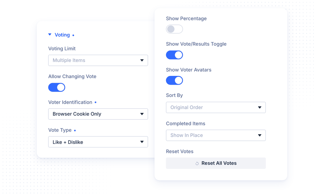
- Voting Limit lets a visitor vote on Multiple Items (each item independently) or on a Single Item only, like a classic poll
- Allow Changing Vote lets visitors click their vote again to remove it, or click another button to switch (on by default). Turn it off to make every vote final, for example in a contest
- Voter Identification decides how the module recognizes a returning voter (see below)
- Vote Type shows a Like button, a Dislike button, or both (Like + Dislike)
- Use Like Icon / Use Dislike Icon replaces the default emoji with a Divi icon. When the toggle is off, you can upload your own image instead
- Show Percentage shows a percentage and a progress bar next to every vote button
- Percentage Based On calculates percentages from Unique Voters (the share of voters who chose the item, best for roadmaps and wishlists) or from All Votes (the share of all votes cast, so the percentages add up to 100%)
- Show Vote/Results Toggle shows the switch between the Vote and Results views above the items
- Show Voter Avatars shows the total number of voters with a small avatar cluster. Logged-in voters show their real avatar, and guests show a generic icon
- Sort By shows the items in their Original Order, or sorted by Most Votes or Least Votes. Sorting only affects the live page, not the item order in the builder
- Completed Items keeps items with the Completed status in place, moves them to the bottom, or hides them
- Reset Votes permanently deletes every vote of this module. You see the exact number of votes before you confirm, and the reset takes effect immediately, without saving the page
Voter Identification has four options. Combined (Account + Cookie) is the recommended one: it uses the account for logged-in visitors and a browser cookie for guests. Account Only recognizes logged-in users only, so guests can vote without limits. Browser Cookie Only recognizes every visitor by browser, so clearing cookies or switching browsers allows voting again. IP Address Only treats every IP address as one voter and is not recommended, as people sharing a network (offices, public Wi-Fi, mobile carriers) count as one person.
NOTE: With Like + Dislike, the Results view shows how liked each item is (likes out of all its votes), and Most Votes sorting ranks items by likes minus dislikes.
Vote Items
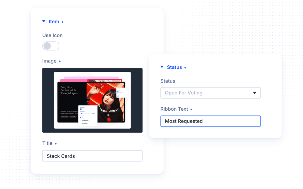
Each child item is one option. Its Item group holds the content: Use Icon switches between an Image and a Divi icon, followed by the Title and an optional Description. Leave the description empty to show only the title. Reset Votes permanently deletes the votes of this one item.
The Link group can turn the item title into a link, with an option to open it in a new tab.
Status and Ribbons
The Status group of each item turns the module into a public roadmap. Status can be Open For Voting, Planned, In Progress, Completed or Declined, and every status except Open shows a ribbon with its name. Ribbon Text replaces the status name on the ribbon, for example “Shipped in v2.5”. On an Open item, any text here shows a ribbon, for example “New” or “Most Requested”.
Voting stays open for Open, Planned and In Progress items. Completed and Declined items close voting but keep showing their final votes, so visitors can see what was decided.
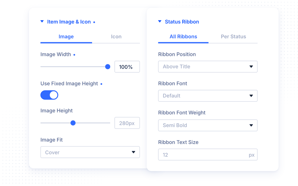
The parent module’s Status Ribbon design group styles all ribbons. The All Ribbons tab sets the Ribbon Position (Above Title, Top Left Badge, Top Right Badge or Corner Ribbon) and the ribbon font, border and spacing. The Per Status tab sets a background and text color for each status. Every item also has its own Status Ribbon design group with a Ribbon Background and Ribbon Text Color, for example to give a custom label its own color.
Results
Visitors switch to the Results view with the toggle above the items. Each item then shows its percentage, its vote count and a progress bar. In the Leaderboard layout, the whole row fills up like a progress meter instead.
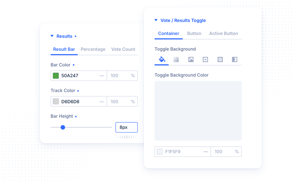
The Results design group has three tabs: Result Bar (bar color, track color and bar height), Percentage and Vote Count (their fonts). Each item can override the bar colors in its own Results group.
NOTE: In the Visual Builder, items have no real votes yet. Open the Results design group, or click Results on the canvas, to preview the view with sample numbers.
Design Settings
The parent module styles every item at once. Each Vote Item has the same design groups to override the look of a single item.
- Title styles the optional module title
- Vote / Results Toggle styles the switch above the items in three tabs: Container, Button and Active Button. Toolbar Alignment places the toggle and voters count left, center, right, or at both ends
- Voters styles the “voters” text next to the avatars
- Item sets the background, border, box shadow and Item Padding of every item
- Item Image & Icon sets the image and icon look (see below)
- Item Text styles the title and the description
- Status Ribbon styles the ribbons (see above)
- Vote Button has a Default tab and a Voted State tab, so the button a visitor clicked can stand out
- Results styles the Results view (see above)
The Image tab of Item Image & Icon sets the Image Width inside the item (leave it empty to use the layout’s default). Use Fixed Image Height gives every image the same Image Height, with Image Fit set to Cover (fill and crop) or Contain (show the whole image). Turn it off to keep each image’s own proportions, which works best when all images are the same size. The Icon tab sets the icon color, size, alignment, background, border, shadow and spacing.
Fair Voting and Privacy
The Vote module is built to keep results honest. Every visitor can vote only once per item, and the server checks every vote, so editing the page code or sending fake requests does not add votes. Votes are only accepted from your own website, and a single network can add at most 10 new guest voters per hour, which stops scripts from flooding the poll while still letting colleagues in an office vote. Closed items (Completed and Declined) reject votes on the server, even from old cached pages.
Guest voters are recognized with an anonymous browser cookie that is only set when someone actually votes. IP addresses are never stored in readable form.
Advanced Settings
The Advanced tab includes all standard Divi options: CSS ID & Classes, Custom CSS, Conditions, Visibility, Transitions, Position and Scroll Effects. The Custom CSS section has dedicated fields for the Module Title, Vote/Results Toggle, Vote/Results Button, Active Button, Voters, Items, Leaderboard Rank, the item Image, Status Ribbon, Title and Description, the Vote Button, Vote Icon and Vote Count, and every part of the Results view. Each Vote Item adds the same fields for its own elements.
Design Ideas
- Public roadmap uses the Leaderboard layout sorted by Most Votes, a Status on every feature, Completed Items: Move To Bottom and Percentage Based On: Unique Voters.
- Hot or Not uses Like + Dislike on a dark section, a Grid of design styles and the Results view to show what visitors love.
- Classic poll sets Voting Limit to Single Item with Allow Changing Vote on, so every visitor picks one favorite, for example a coffee or a team retreat destination.
- Contest turns Allow Changing Vote off, uses the Carousel with large photos and a heart icon, and shows a ribbon like “Fan Favorite” on the leader.