
Info Circle
Meet the Pixel Info Circle module for Divi! Arrange your services, features or process steps as icons around a circle — hover or click an icon and its content animates into the center. A rotating, interactive alternative to plain blurb grids that instantly draws attention.
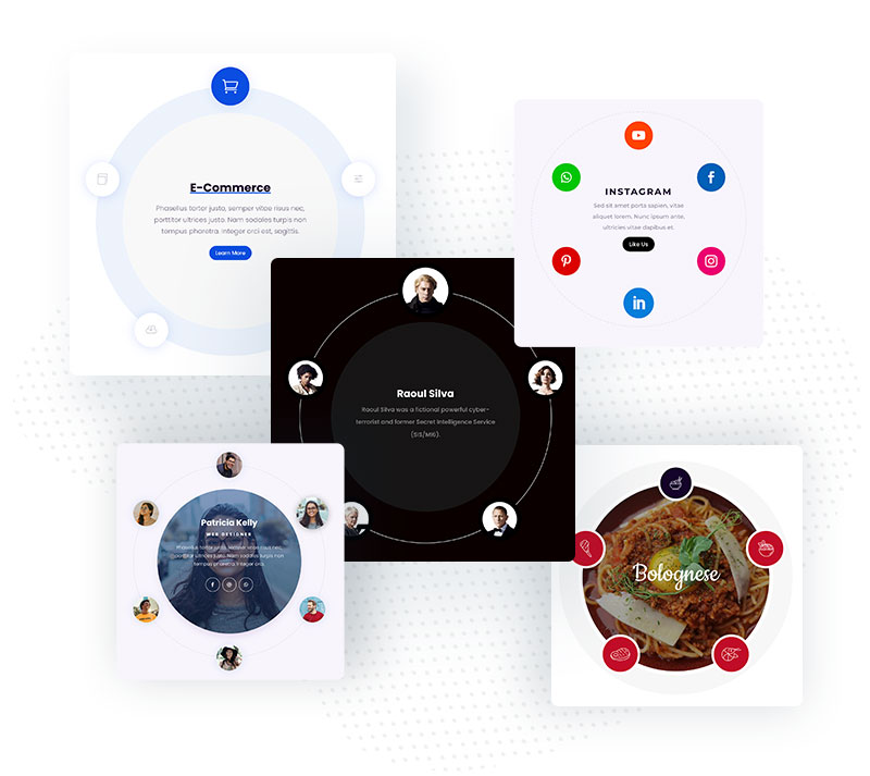
With the Pixel Info Circle module you can:
- Place any number of items around a circle, each with its own icon or image
- Reveal each item’s title, description, image and button in the circle’s center
- Trigger items by hover or click, or let Auto Mode cycle through them
- Auto-rotate the whole circle in a loop with configurable speed and angle
- Choose from 19 content animations — fades, bounces, flips, zooms and more
- Fall back to a simple list layout where the circle doesn’t fit
How the module works
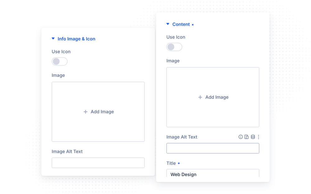
The Pixel Info Circle is a parent/child module. Each child item has two parts: the Info Image & Icon shown on the circle’s edge, and the Content (icon/image, title, description, button) revealed in the center when the item activates.
How to add the Info Circle module
- Open a page with the Divi Visual Builder
- Click the + (Add New Module) button
- Search for Pixel Info Circle and click it to insert the module
- Add a child item for every point on the circle and fill in its content
Settings
The parent Settings group controls the circle’s geometry and behavior:
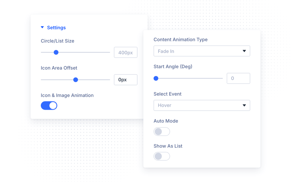
- Circle/List Size — the diameter of the circle (default 400px)
- Icon Area Offset — nudge the icon ring inward or outward (−100 to 100px)
- Start Angle — where the first item sits on the circle (0–360°)
- Select Event — activate items on Hover or Click
- Icon & Image Animation — animate the edge icons on activation
- Content Animation Type — how the center content appears: fades, zooms, bounces, flips, rotations and more (19 presets)
- Show as list — render the items as a vertical list instead of a circle
Auto Mode
- Auto Mode — automatically cycle through the items every Auto Time milliseconds (default 3000ms)
- Auto Rotate Mode — rotate the circle itself: None, Loop or Repeat
- Auto Rotate Time / Auto Rotate Angle — the speed and step of the rotation
- Reverse Animation Direction — flip the rotation direction
NOTE: The circle layout needs room. On narrow screens enable Show as list, or reduce the Circle/List Size responsively, so the items stay usable on mobile.
Child Items
Each child item’s Content tab has two groups:
- Info Image & Icon — the marker on the circle’s edge: enable Use Icon and pick an icon, or upload an image
- Content — what appears in the center: an optional icon/image, Title, rich-text Description and an optional Button
Design Settings
- Circle & List (parent) — the circle’s visual styling
- Info Image & Icon — size, color and background of the edge markers, with separate hover and active states (parent defaults, overridable per item)
- Content Image & Icon / Content Text / Content Button (items) — styling for the center content
Design Ideas
- Services wheel — 6 services around the circle, Select Event Hover, FadeIn content animation.
- Process steps — numbered icons around the circle with Auto Mode cycling every 4 seconds — a self-playing explainer.
- Team circle — member photos as edge markers, bios and a profile button in the center, activated by Click.