
Divider
Meet the Pixel Divider module for Divi! Go far beyond a plain horizontal line — build section dividers with text, icons, images or even Lottie animations in the middle, framed by fully customizable line decorations on both sides.
With the Pixel Divider module you can:
- Put text, an image, an icon or a Lottie animation in the center of the divider
- Frame the content with line decorations in eight styles — solid, dashed, dotted, double, groove, ridge, inset and outset
- Replace either line with an icon, image, Lottie or leave it empty
- Style the second decoration independently, or let it mirror the first automatically
- Switch between a horizontal row layout and a stacked column layout
How to add the Divider module
- Open a page with the Divi Visual Builder
- Click the + (Add New Module) button
- Search for Pixel Divider and click it to insert the module
Content
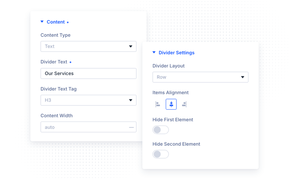
In the Content group, choose the Content Type displayed in the middle of the divider:
- Text — enter the Divider Text and choose its HTML tag (Divider Text Tag,
h1–h5,p,spanordiv) - Image — upload an image
- Icon — pick a Divi icon and set its Icon Color
- Lottie — upload a Lottie File, or enable Use JSON Animation Code and paste the animation JSON directly
The Content Width option controls how much space the center content takes.
Divider Settings
- Divider Layout — arrange the decoration and content in a horizontal Row or a vertical Column
- Items Alignment — align the whole arrangement left, center or right
- Hide First Element / Hide Second Element — hide either decoration to build one-sided dividers
Decoration
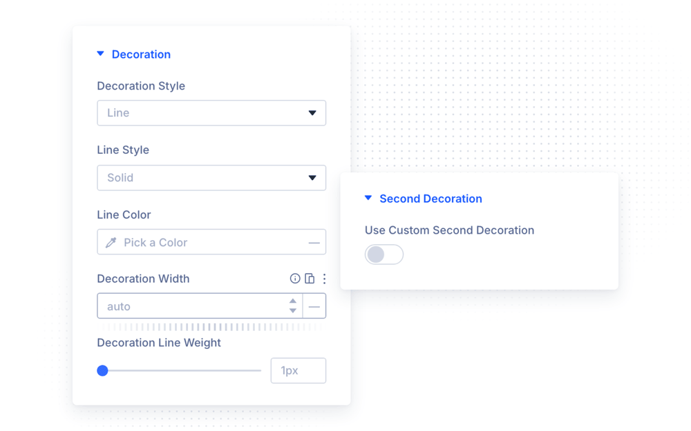
The Decoration group styles the first (left) decoration:
- Decoration Style — Line, Image, Icon, Lottie or Empty
- For lines: Line Style (solid, dashed, dotted, double, groove, ridge, inset, outset), Line Color and Decoration Line Weight
- For icons: Divider Icon, Icon Color, Icon Size and Icon Alignment
- Decoration Width — the width of the decoration (or font size in case of an icon)
Second Decoration
By default, the second (right) decoration mirrors the first one automatically. Enable Use Custom Second Decoration to configure it independently — it gets the same set of options as the first decoration, so you can combine, for example, a solid line on the left with a dotted line or an icon on the right.
The same applies to styling: in the Design tab, enable Use Custom Second Decoration Styling to break the mirror and style the second decoration’s spacing separately.
Design Settings
- Content Style / Content Text — spacing and full font controls for the center content
- Decoration Style / Second Decoration Style — spacing for each decoration
The module also supports all standard Divi design options — Sizing, Spacing, Border, Box Shadow, Filters, Transform and Animation.
Design Ideas
- Classic section break — Text content with an elegant serif font, thin solid lines on both sides.
- Icon divider — Content Type Icon with a small brand glyph, dotted lines, Items Alignment center.
- Animated accent — a subtle looping Lottie in the center between two short solid lines.
- One-sided lead-in — Hide Second Element, align left, and use the divider as a heading lead-in line.