Balloon
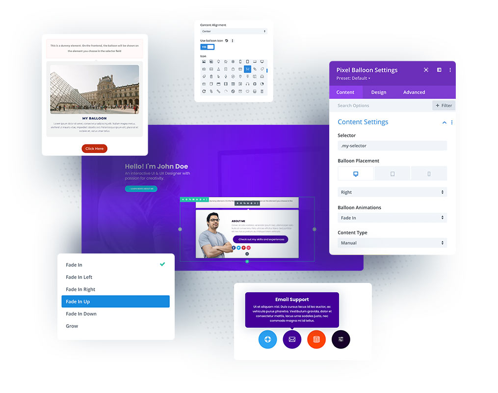
The balloon module is the most underrated and underused element in web design projects. In general, it’s a tooltip that can be displayed after the user hovers or clicks on a specific element on your website. The Divi Pixel Balloon module comes with powerful settings. You can easily display icon, title, description and button, or if you need more complex layout to be displayed, you can use Divi Library item.

Content Settings
In Content Settings, we can find the core options of our Balloon module. This is the place where we set the tooltip selector, placement, animation, content type. We can also enable or disable tooltip interactivity and select to display tooltip on click.
Selector
To trigger tooltip on any element on our page, we need to add a Balloon selector. This could be a CSS ID or Class of the element on our page.
Our selector must have class prefix .(dot for CSS Class) or #(hash symbol for CSS ID).
The sample selectors:
.my-balloon
#my-balloon
Balloon Placement
In Balloon Placement, we can select where our tooltip will be displayed. We can choose 1 of 5 options: Left, Right, Top, Bottom, and Auto. This option is responsive, so we can select placement individually for each device. Selecting an Auto option will ensure to display tooltip automatically in free space.
Balloon Animation
Divi Pixel Balloon module comes with 6 built-in animations: Fade In, Fade In Left, Fade In Right, Fade In Up, Fade In Down and Grow.
Content Type
If we need to build a simple tooltip with a title and description, then a Manual content setting should be used. This Content Type allows us to add icon/image, Title, Description, and Button and customize it directly in the Balloon module settings.
For more complex layouts, the Divi Library option should be used, which allows us to design our tooltip in Divi Builder, and select it to be displayed in the Balloon Divi Library Field. If we select this option, then we need to build a layout using the Divi Builder and save a section/row or module to the Divi Library. The saved layout might be not available in the dropdown select, so we will need to refresh the page where we want our custom tooltip to be displayed.
Interactive
We can enable interactivity for our tooltip, so users will be able to mouseover on the tooltip and interact with its elements. This option will be used when we want our tooltip to display clickable elements.
Trigger on Click
By default, our tooltip will be triggered when the user mouseovers over the element with our tooltip selector. This triggering behaviour can be changed by enabling the Trigger on Click option, so our tooltip will be displayed after the element with a selector is clicked.
When the Button module is used for triggering the Balloon, there must be a dummy link to the button added “#”.
Append to option
The Append To option allows us to select the element where the tooltip HTML will be placed. We can select Selector, Parent of Selector, or Body. By default Parent of Selector is selected and will work for most cases.
In some scenarios, our tooltip might be conflicting with other elements in the same section, then the Append To option should be changed to Selector or Body.
Manual Item Content
If we select Manual as a Content Type, then we can add image/icon, title, description and button.
Balloon Arrow
We can easily add the tooltip arrow and customize its color by enabling the Use Balloon Arrow option in the modules Content Settings section.
NOTE: Some of the below module settings won’t apply if the Divi Library Content Type is used. To customize the Divi Library tooltip layout go to Divi/Divi Library and search for the layout that is used for the Ballon module.
Background
If we are using Manual Content Type, then we can customize our tooltip background in the Background settings. This option won’t apply to layouts from the Divi Library, so if we are using the Divi Library item, then we need to customize our tooltip in the Divi Library (Divi → Divi Library).
Design Settings
In design settings, we can customize our tooltip image/icon, texts, button, spacing and sizing.
Ballon Image/Icon
If we use Manual Content Type, we can add an image or icon to our tooltip and customize it in the Design → Balloon Image/Icon section. We can select icon color, enable circle icon, add a border, and control icon size.
Ballon Text
In Design → Balloon Text we can customize the title and description text.
Button
If we enable the Button in Content Settings, then we can customize it in the Design → Button section.
Sizing
Sizing is one of the most important settings that we need to take care of if we want our tooltip to be displayed properly on all devices. We can set width and max-width individually for desktops, tablets, and mobiles.
Setting 90vw width for tablets and mobiles, and 90% max-width for tablets and mobiles would be a good starting point.
