Content Slider
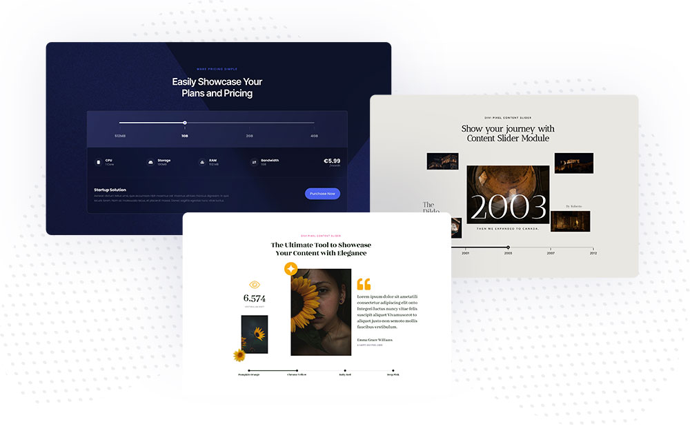
With the Divi Pixel Content Slider, you can create content-rich sections without sacrificing space. The customizable timeline with labels and descriptions lets users easily switch between different Divi layouts. This means you can showcase more content in less space, creating a more engaging and efficient user experience.
Content Settings
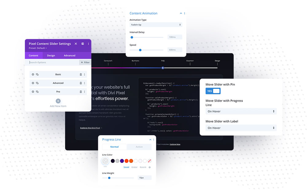
The Content Slider module allows you to add multiple child modules. Each child module will create an item on the timeline with a label and description text. In the Content tab of the parent module, you will find Settings and Content Animation toggle.
Settings
Show Active Selector Only in Visual Builder – this option, when enabled, will hide all sections/rows/modules with selectors that are not active. This option can be enabled after you complete all layouts, as it will hide all sections and only show one with the Active Selector option enabled.
Label Position – This option lets you choose the label and description text position. You can display them on the top or bottom of the timeline line.
Move Slider with Pin – You can move the slider after clicking the timeline pin or mouseover.
Move Slider with Progress Line/Move Slider with Label – You can move the slider using the progress line and labels. There are three options: Disabled/On Click or On Hover.
Content Animation
The Content Slider module has animation settings to switch between contents and improve the user experience smoothly. There are 19 built-in animation effects. You can also adjust the Interval Delay and Animation Speed.
To select the content animation, go to Content → Content Animation and choose one of the available effects.
Using Content Slider
The Content Slider module was built to ensure smooth and easy implementation. All you need to do is design your layouts using the Divi Builder and add CSS selectors to the child module and sections/rows/modules you want to reveal after the label or pin is clicked.
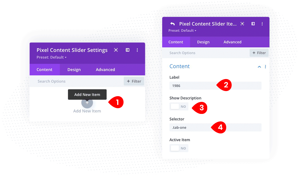
- Add module to the page and click Add New Item
- In the child module Content toggle add a Label
- Select if you want to display the Description below the Lable or not
- Add Selector. It could be a CSS Class (.tab-one) or CSS ID (#tab-one)
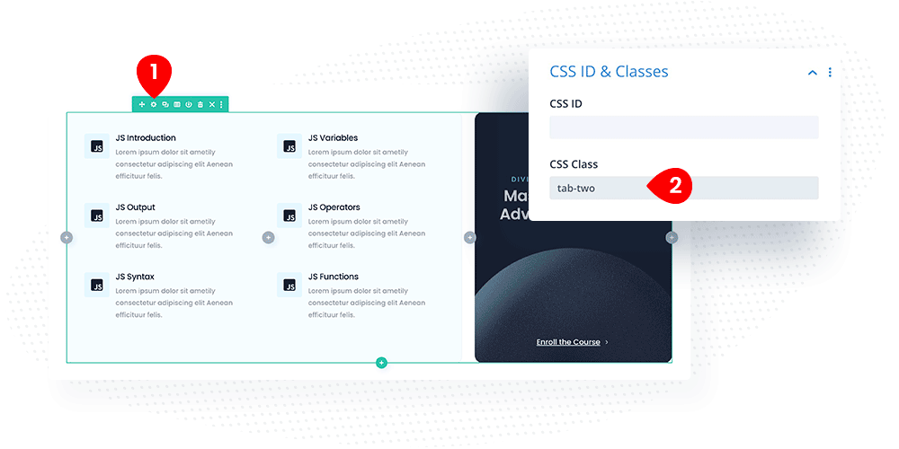
Repeat this step to add more Content Slider items. Make sure to use different selectors, like .tab-two, .tab-three etc.
In the next step, create layouts to be displayed in the Content Slider module. You can use sections, rows, or modules. In this sample, we used a row for each tab. After you finish, add a selector to the CSS ID & Classes toggle.
- Open row setting by clicking the toggle icon
- Go to Advanced tab
- In CSS ID & Classes toggle, add CSS ID or CSS Class
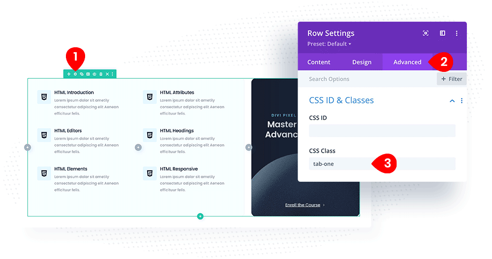
Repeat this step for other layouts you want to display within the Content Slider module. You can add as many items as you wish. You can also use the same CSS Class for multiple rows to display them within one tab. Place the Content Slider module below the designs if you want to show the progress line below the layouts.
Open specific slide
To open a specific slide based on a URL parameter, follow these steps:
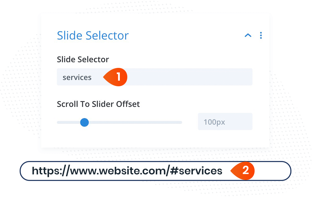
- Add the Slide Selector in the child module settings: navigate to Content → Slide Selector
- Once the selector is added, you can open a specific slide using the page URL and anchor link with the selector
