Hover Box
The Pixel Hover Box module has been developed to dynamically display your content with an attention-grabbing presentation. You can add default and hover elements in the module settings, so the card will display different content on mouseover. You can add Images/Icons, Titles, Descriptions, and Buttons for both the default and hover states, and display hover content with a silky-smooth animation. The module comes with 6 animations, so you can be assured that there will be a style that will meet your needs.
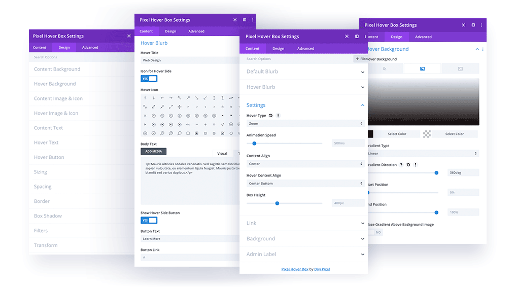
Content
In the Content tab you can add Default/Hover content, select animation style and speed, define the content alignment for both cards, and set the Box Height.
Content → Default Blurb
In this section you can add the content that will be displayed by default.
Icon/Image
Title
Description
Content → Hover Blurb
In this tab you can add the content that will be displayed on mouseover.
Icon/Image
Title
Description
Button
Content → Settings
In the Settings tab, you can select Hover Animation, Speed, Content Alignment, and Box Height.
Hover Type:
Slide – Bottom to Top, Top to Bottom, Left to Right, Right to Left
Fade
Zoom
Animation Speed
Content Align/Hover Content Align: Top Left, Center Top, Top Right, Left, Center, Right, Bottom Left, Center Bottom, Bottom Right
Box Height
Design → Content Background
In Content Background you can set the default blurb background adding solid color, gradient, or an image.
Design → Hover Background
In the Hover Background tab you can set the background for the hover blurb, and add solid colors, gradients, or images.
Content → Image & Icon
The Content Image & Icon tab allows the customization of the icon or image selected for the default blurb, allowing tweaking of borders, and adding shadows.
Content → Hover Image & Icon
The Hover Image & Icon tab allows customizing of the icon or image selected for the default blurb. You can tweak borders, and add shadows.
Content → Content Text
In this tab you can customize the title and description text.
Content → Hover Text
In this tab you can customize the title and description text on the hover card.
Content → Hover Button
In this section you can style the button on the hover card.