
Text Reveal
Meet the Pixel Text Reveal module for Divi! Reveal your headlines word by word, letter by letter or line by line as visitors scroll down the page. Combine blur, fade, color, highlight and slide effects to create modern, scroll-driven typography — designed entirely in the Divi Builder, with no custom code required.
With the Pixel Text Reveal module you can:
- Reveal text as you scroll, when the module enters the viewport, or immediately on page load
- Split the text into words, letters, lines or blocks and stagger the reveal of each unit
- Choose from five reveal effects — Blur, Fade, Color, Highlight and Slide/Fade
- Combine multiple text segments with different effects in a single headline
- Reverse the animation when scrolling back up, or replay it every time the module re-enters the viewport
- Fine-tune the scroll range, easing and smoothing for a perfectly timed reveal
How the module works
The Pixel Text Reveal module is a parent/child module. The parent module controls when the reveal is triggered and how it is timed, while each child item holds a text segment with its own reveal effect, split mode and styling.
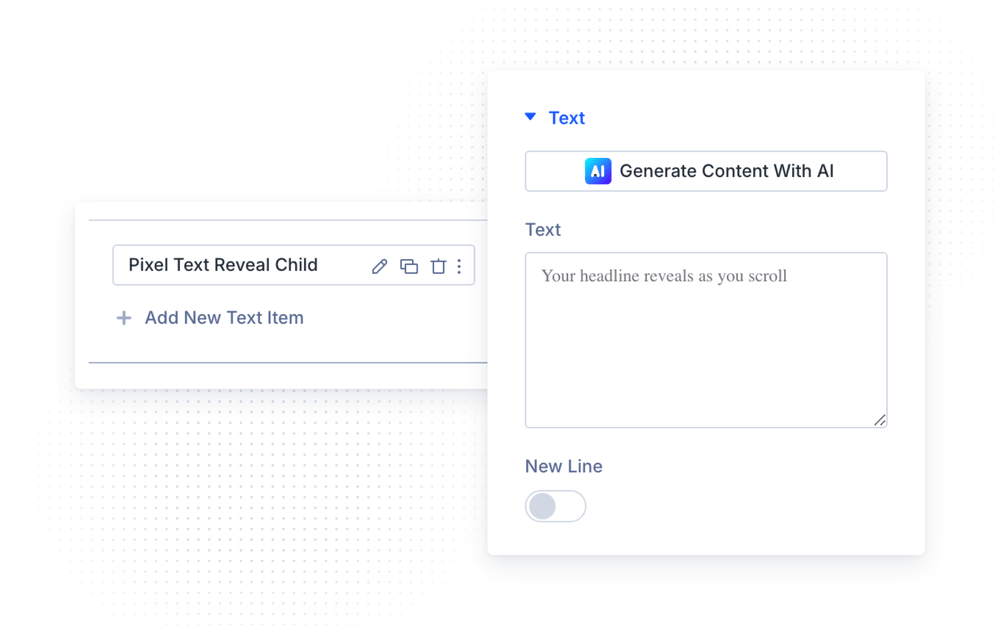
You can add as many child items as you need — each one can use a different effect, so a single headline can mix a highlighted phrase with blurred or color-revealed words. With the New Line option, a child item either continues on the same line as the previous segment or starts on a new line.
How to add the Text Reveal module
- Open a page with the Divi Visual Builder
- Click the + (Add New Module) button
- Search for Pixel Text Reveal and click it to insert the module
- Add or edit the child Text Reveal items and enter your text segments
- Configure the trigger in the parent module and the reveal effect in each child item
NOTE: The parent module includes a Show Visual Builder Preview option (enabled by default). It displays a reveal scrubber in the Visual Builder so you can preview the animation while designing — the scrubber is never shown on the live website. The final scroll-driven result is best checked on the front-end of your site.
Reveal Trigger Settings
In the Reveal Trigger settings group (Content tab of the parent module), you can decide when and how the reveal animation runs.
The Text Wrapper Tag option sets the HTML tag that wraps the whole reveal text — from h1 to h6, p or span. Pick the tag that matches your page’s heading hierarchy; the module outputs real text, so it stays fully crawlable for search engines.
The Trigger Type option offers three modes:
- With Scroll — the reveal progress is tied directly to the page scroll position. The text reveals as the visitor scrolls down and, with Reverse On Scroll Up enabled, un-reveals when scrolling back up.
- On Viewport — the reveal plays once as soon as enough of the module becomes visible.
- On Load — the reveal plays immediately when the page loads.
With Scroll options
When Trigger Type is set to With Scroll, you can fine-tune the scroll range and feel:
- Reverse On Scroll Up — reverse the reveal animation when scrolling back up (enabled by default)
- Scroll Smoothing — smoothing duration (0–500ms) applied to scroll-linked updates, for a softer, slightly delayed response
- Scroll Easing — easing curve for the reveal progress: Linear, Ease In, Ease Out, Ease In Out or Custom
- Scroll Start Element / Scroll Start Viewport — the reveal starts when this position of the element meets this position of the viewport (defaults: element 100%, viewport 85% — the top of the module near the bottom of the screen)
- Scroll End Element / Scroll End Viewport — the reveal completes when this position of the element meets this position of the viewport (defaults: element 0%, viewport 50% — the module reaching the middle of the screen)
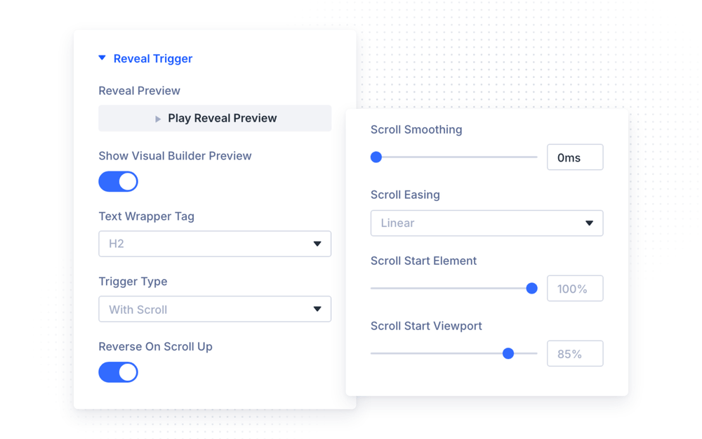
NOTE: The Start/End Element and Viewport values define the scroll window in which the reveal happens. Widen the window (e.g. end at viewport 20%) for a slower, longer reveal — narrow it for a snappier one.
On Viewport options
When Trigger Type is set to On Viewport:
- Viewport Threshold — how much of the module must be visible before the reveal starts (default 75%)
- Animation Duration — duration of the reveal animation (100–5000ms, default 800ms)
- Animation Delay — delay before the animation starts (0–3000ms)
- Replay On Re-enter — replay the animation every time the module re-enters the viewport
On Load options
When Trigger Type is set to On Load:
- Animation Duration — duration of the reveal animation (100–5000ms, default 800ms)
- Animation Delay — delay before the animation starts (0–3000ms)
- Animation Repeat — play the animation Once or Loop it continuously
Child Item Settings
Each child item represents one text segment and is configured in its own settings modal.
Text
Enter your text in the Text field. The New Line option controls the flow: when enabled, this segment begins on a new line; when disabled, it continues on the same line as the previous child item — this is how you mix differently styled segments inside one sentence.
Reveal Effect
In the Reveal Effect settings group, you choose how the segment is revealed:
- Blur — the text sharpens from a blur. Adjust the Blur Amount (0–30px) and the Blur Curve easing.
- Fade — the text fades in. Set the Initial Opacity (before the reveal, default 20%) and Final Opacity (after the reveal).
- Color — the text transitions between two colors. Set the Unrevealed Text Color and the Revealed Text Color.
- Highlight — a background highlight sweeps across the text. Configure the Highlight Background Color, Highlight Padding, Highlight Border Radius and the Highlight Reveal Mode — the background can expand across the text or fade in with opacity. The Unrevealed/Revealed Text Color options are available here too.
- Slide/Fade — instead of revealing the text, this effect makes it recede: the words or letters shrink and fade away one after another as the module sinks toward the bottom of the screen, with the bottom-most unit dropping away first. Scrolling back up reassembles the text in reverse. Great for headlines that gracefully dissolve as the visitor moves on.
NOTE: The Slide/Fade effect works on small reveal units, so it only appears in the Reveal Effect dropdown when Split By is set to Word or Letter. If you later switch the split to Line or Block, the segment falls back to the Blur effect.
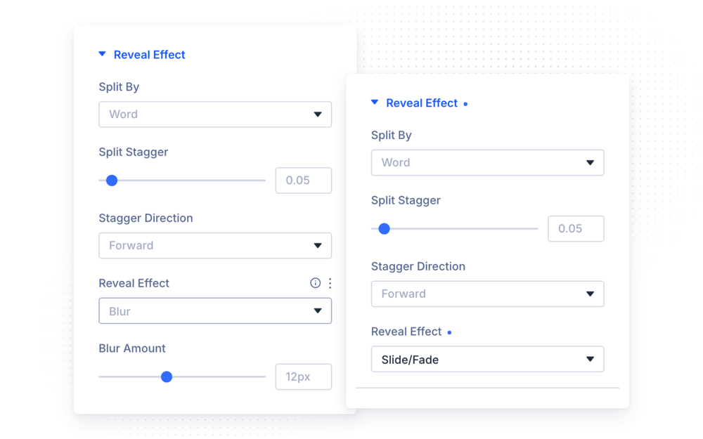
The Split By option divides the segment into reveal units — Block (the whole segment at once), Word, Line or Letter. For any split other than Block, two more options appear:
- Split Stagger — the delay between each unit during the reveal (0–1, default 0.05)
- Stagger Direction — the order in which units reveal: Forward, Reverse, Center Out or Random
NOTE: Letter splits produce the most dramatic effect but also the most reveal units — on long paragraphs, prefer Word or Line splits and keep the letter split for short headlines.
Design Settings
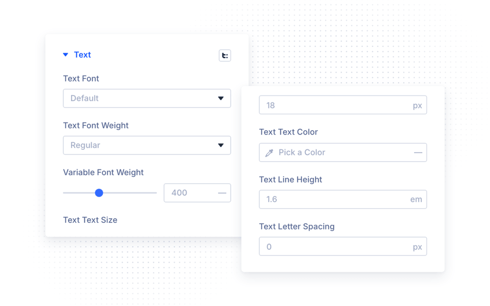
In the Text group of the Design tab, you have full Divi font controls for the revealed text — font family, weight, style, color, size, line height and letter spacing. The parent module styles all segments at once, and each child item has its own Text group to override the styling per segment.
The Spacing group of the parent module includes the Text Max Width option (default 100%), which limits the width of the reveal text wrapper — useful for controlling line breaks on wide layouts.
When using the Highlight effect, the parent’s Highlight Shadow group adds a box shadow to the highlight background.
Advanced Settings
The Advanced tab includes all standard Divi options — CSS ID & Classes, Custom CSS, Conditions, Visibility, Transitions, Position and Scroll Effects — plus two module-specific groups.
Attributes
The ARIA Label option sets an accessible label for the reveal text. Screen readers get the full label instead of the split-up units; when left empty, it defaults to the text content automatically.
Performance
- Disable On Mobile — disable the reveal animation on mobile devices; the text is simply shown revealed
- Disable Below Breakpoint — disable the animation below the Phone or Tablet breakpoint
- Fallback Revealed — show the fully revealed text when JavaScript is unavailable (enabled by default)
NOTE: Scroll-linked animations on long letter-split texts can be demanding on low-end phones. If you notice choppy scrolling on mobile, enable Disable On Mobile — visitors still get the full text, just without the animation.
Custom CSS selectors
In the Custom CSS section, the parent module exposes dedicated fields for its inner elements:
- Reveal Container — the module’s outer reveal container
- Text Wrapper — the wrapper element around all text segments
- Split Unit — every individual reveal unit (word, letter or line)
- Highlight Unit — the highlight background elements
- Revealed Unit — units that have already been revealed
Design Ideas
- Scroll-driven hero headline — Trigger Type With Scroll, split the headline by Word with the Blur effect and a small stagger; keep Reverse On Scroll Up enabled for a living, scrubbing headline.
- Highlighted key phrase — build the sentence from several child items on the same line, and give just one segment the Highlight effect with your brand color.
- Reading-style color reveal — the Color effect with a light gray Unrevealed Text Color and a Line split makes paragraphs “read themselves” as the visitor scrolls.
- Attention opener — Trigger Type On Load with a Letter split, Center Out stagger direction and the Fade effect for an instant, cinematic page opening.
- Dissolving headline — the Slide/Fade effect with a Word split and Trigger Type With Scroll makes a headline gracefully break apart as the visitor scrolls past it.