
Expanding CTA
Meet the Pixel Expanding CTA module for Divi! Turn a simple call-to-action into an immersive, full-screen moment: when the visitor clicks, the CTA zooms and expands into an overlay that captures full attention — perfect for signups, promotions and announcements that must not be missed.
With the Pixel Expanding CTA module you can:
- Build the CTA from an image or icon, a title, a rich-text description and up to two buttons
- Expand the CTA into a full-screen overlay with a configurable zoom effect
- Hide the site header and the Back To Top button while the overlay is open
- Control whether the overlay sits above or below the module background
- Optionally make the whole CTA a link instead
How to add the Expanding CTA module
- Open a page with the Divi Visual Builder
- Click the + (Add New Module) button
- Search for Pixel ExpandingCTA and click it to insert the module
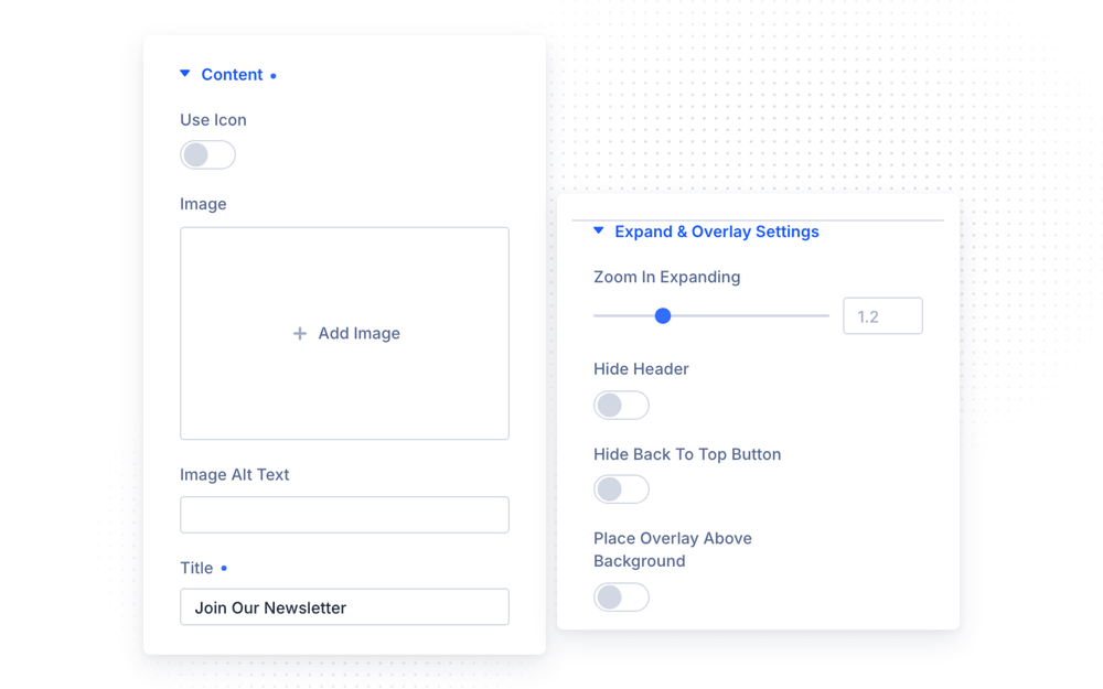
Content
In the Content group you build the CTA itself:
- Use Icon — switch between an uploaded image and a Divi icon
- Title — the CTA heading
- Description — rich-text content
- Show Button / Show Second Button — add one or two buttons, each with its own text and link
Expand & Overlay Settings
- Zoom in Expanding — how much the CTA scales while expanding (0.5–3, default 1.2)
- Hide Header — hide the site header while the overlay is open
- Hide Back To Top Button — hide the Back To Top button while the overlay is open
- Place Overlay Above Background — when enabled, the overlay covers the module’s background; when disabled, the overlay sits underneath it
Link
Instead of (or in addition to) the expanding behavior, the Link group lets you set a Content Link URL and choose whether it opens in a new window.
Design Settings
- Expanding CTA — the overlay styling
- Image & Icon — Icon Color, Image & Icon Background Color, Image & Icon Size (1–200px, default 96px) and Alignment
- Text — full Divi font controls for title and description
- Button One / Button Two — separate full button styling for each button
- Sizing — Content Width and Content Alignment
- Main Background — the module’s base background
The module also supports all standard Divi design options — Spacing, Border, Box Shadow, Filters, Transform and Animation.
Design Ideas
- Newsletter takeover — icon + short title, one button; enable Hide Header so the expanded overlay is fully distraction-free.
- Promo reveal — a product image with a bold title and two buttons (“Buy Now” / “Learn More”), strong zoom (1.5+) for a dramatic expansion.
- Quiet CTA — skip the expansion styling and use the Content Link URL to make the whole card a simple link.