
Pricing Table
Meet the Pixel Pricing Table module for Divi! Compose pricing cards row by row — heading, price, features, images, ribbons and buttons are all individual building blocks you stack in any order, so your pricing card can look exactly the way you want instead of following a fixed template.
With the Pixel Pricing Table module you can:
- Build a pricing card from stacked row items — each row is its own child module
- Choose from seven row types: Text, Image, Icon, Price, Feature, Ribbon and Button
- Format the price with a prefix and suffix (currency, billing period) in configurable positions
- Add feature rows with icons, or a ribbon to highlight the best plan
- Animate the card with entrance animations — fades, bounces, flips, rotations and more
How the module works
The Pixel Pricing Table is a parent/child module. The parent is one pricing card; each child item is one row of the card, and its Item Type decides what the row shows. Reorder the rows by dragging them in the builder — the card is rendered exactly in that order. Place several Pricing Table modules side by side in Divi columns to build a full pricing section.
How to add the Pricing Table module
- Open a page with the Divi Visual Builder
- Click the + (Add New Module) button
- Search for Pixel Pricing Table and click it to insert the module
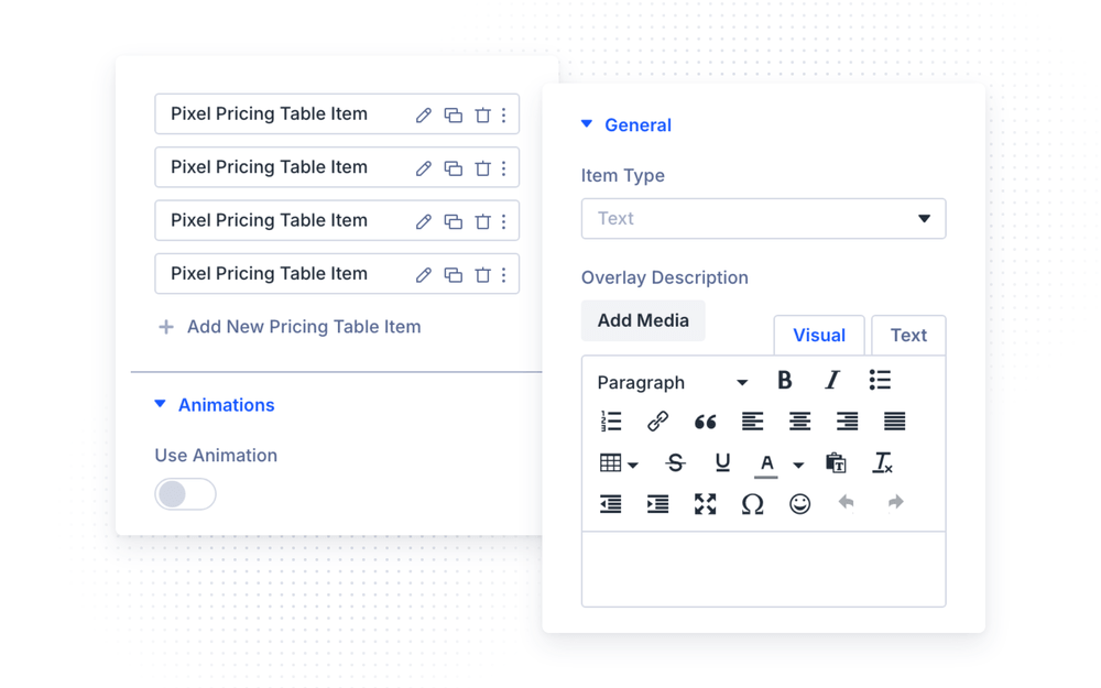
- Add a child item for every row of the card and pick its Item Type
Row Item Types
Each child item’s General group starts with the Item Type select:
- Text — a heading or description row; set the text and its HTML tag
- Image — an image row, with Image Alt Text and optional Gallery Images For Lightbox
- Icon — an icon row with color, background and alignment options
- Price — the price row: Price, Price Prefix (e.g.
$), Price Suffix (e.g./month) and their Prefix/Suffix Placement - Feature — a feature line with Feature Text, a Feature Icon and its Icon Placement
- Ribbon — a corner ribbon: Ribbon Type (text or image), Ribbon Text and Ribbon Position
- Button — a call-to-action row: Button Text, Button Link and link target
Animations
In the parent’s Animations group, enable Use Animation and pick the entrance animation — Fade In, Grow, BounceIn, FlipInX/Y, RotateIn, JackInTheBox and more, each with directional variants. Set the Animation Speed and an optional Animation Delay to stagger multiple pricing cards.
Design Settings
The parent styles the card as a whole (Text, Module Text, plus the standard Divi groups). Each row item brings design groups matching its type:
- Heading Text / Text / Module Text — typography per row
- Price Prefix Text / Price Suffix Text — separate styling for the prefix and suffix, so
$and/monthcan be smaller and lighter than the price itself - Feature Icon Style — icon size, color and background for feature rows
- Image & Icon — color, background, width and alignment for image/icon rows
- Button — full Divi button styling for button rows
All rows also support the standard Sizing, Spacing, Border, Box Shadow, Filters, Transform and Animation groups.
Design Ideas
- Classic three-plan section — three Pricing Table modules in a 3-column row; the middle one gets a Ribbon row (“Most Popular”) and a stronger button.
- Feature-first card — Icon row, Text heading, several Feature rows with green check icons, Price row near the bottom, Button last.
- Staggered entrance — same FadeIn Up animation on all three cards with increasing Animation Delay for a cascade effect.