
Circular Text
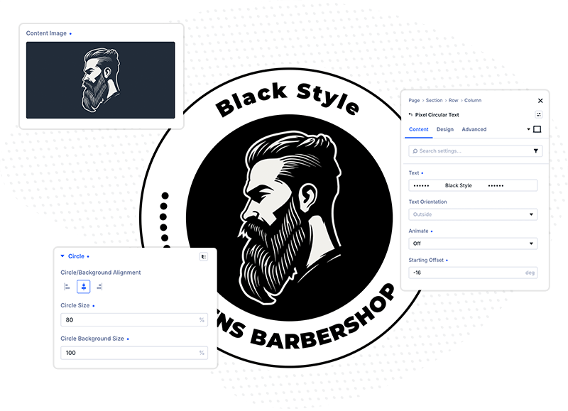
Meet the Pixel Circular Text module for Divi! Wrap any text around a perfect circle and bring it to life with smooth rotation animations. Create eye-catching badges, stamps, scroll-driven accents and logo lockups — all designed natively in the Divi Builder, with no custom code required.
With the Pixel Circular Text module you can:
- Wrap any text along a circular path, facing outside or inside the circle
- Animate the text with a continuous rotation, rotate it on scroll, or keep it static
- Add a second text string along the bottom half of the circle for classic badge designs
- Place an image or icon in the center of the circle and style it freely
- Design a circle background with its own size, color, gradient and border
- Style everything with the full set of Divi design options — fonts, spacing, borders, shadows, filters, transforms and animations
How to add the Circular Text module
The Pixel Circular Text module works like any other Divi module and can be placed in any row or column.
- Open a page with the Divi Visual Builder
- Click the + (Add New Module) button
- Search for Pixel Circular Text and click it to insert the module
- The module is added with placeholder text on a 300px circle — open the module settings to customize it
Text Settings
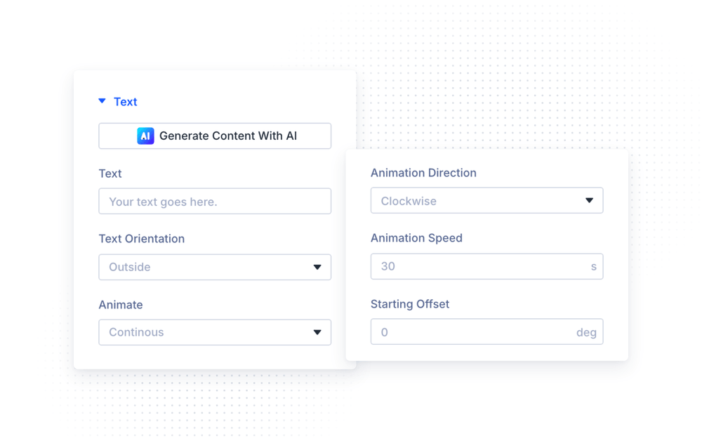
In the Text settings group (Content tab), you can enter the text that will be wrapped around the circle, choose the text orientation, and configure the rotation animation.
Type your text in the Text field — the module automatically distributes the characters along the circular path. The field accepts plain text only: any HTML tags are stripped before rendering, so all styling should be done with the Design → Text options instead of inline markup. With the Text Orientation option you can decide whether the characters face Outside the circle (upright at the top — the classic look) or Inside the circle.
NOTE: The circular text never wraps or auto-scales. If your text is too long for the circle, the end of it will be cut off — and if it is too short, it will leave a visible gap on the ring. Balance the text length with the Circle Size, the font size and the letter spacing until the text fits the way you want.
The Starting Offset option rotates the whole text ring to a custom starting angle (0–360°), so you can position exactly where your text begins on the circle.
Animation Modes
The Animate option controls how the circular text behaves and which additional settings are available:
- Continous — the text rotates endlessly. Use the Animation Speed slider to set how many seconds one full rotation takes (1–300s, default 30s), and the Animation Direction option to rotate the text Clockwise or Counter Clockwise.
- On Scroll — the rotation is driven by the visitor’s scrolling. The text starts rotating when the module enters the viewport and finishes when it leaves.
- Off — the text stays static. This mode unlocks the Bottom Text options described below.
On Scroll options
When Animate is set to On Scroll, three additional options appear:
- On Scroll Multiplier — controls how far the text rotates while the module scrolls through the viewport. With a multiplier of 2.0, the text rotates two full circles during the scroll; with 0.5, it only rotates half way.
- Entry Delay — sets how far the module must scroll into view before the animation starts (percentage of the scroll range).
- Exit Delay — sets how early the animation stops before the module leaves the screen.
Use Entry and Exit Delay together (for example 10% / 10%) to make the rotation happen only while the module is comfortably inside the viewport.
NOTE: The On Scroll rotation is driven by the real page scroll, so the Visual Builder viewport won’t reproduce it accurately. Always preview scroll-driven rotation on the front-end of your site.
Bottom Text
When Animate is set to Off, you can enable the Use Bottom Text option to display a second text string along the bottom half of the circle — perfect for classic stamp and badge designs with text on both the top and bottom arcs.
- Set Animate to Off
- Enable Use Bottom Text
- Enter your text in the Bottom Text Content field
- Fine-tune the Bottom Text Angle (0–360°) and the Starting Offset of the main text until both arcs are balanced
Image & Icon Settings
In the Image & Icon settings group (Content tab), you can place an image or an icon in the center of the circle.
By default, the module uses an image — upload it in the Content Image field and describe it in the Content Image Alt Text field (both support Divi dynamic content). Enable the Use Icon option to use a Divi icon instead, and pick it with the Content Icon icon picker.
The Place Image/Icon Above Text option changes the layout: instead of sitting in the center of the circle, the image or icon is stacked above the circular text.
Design Settings
Text
In the Text group of the Design tab, you have full Divi font controls for the circular text — font family, weight, style, color, size, line height and letter spacing. The module ships with 18px font size and 2px letter spacing by default; a little extra letter spacing usually looks best on a circular path.
Letter spacing is also a handy layout tool: increasing it spreads a short text further around the ring, so you can close the gap on the circle without shrinking the Circle Size or enlarging the font.
NOTE: The circular text is rendered as an
h2heading on the front-end. Keep this in mind for your page’s heading hierarchy and SEO — especially when the module is used purely as a decorative element.
Image & Icon
The Image & Icon group styles the center element. When Use Icon is enabled, you can set the Icon Color and the Icon Font Size (1–120px, default 96px). In image mode, the Sizing options (Width / Max Width) and Box Shadow apply instead. Both modes support the full Divi Background, Border, Spacing and Filters groups.
Circle
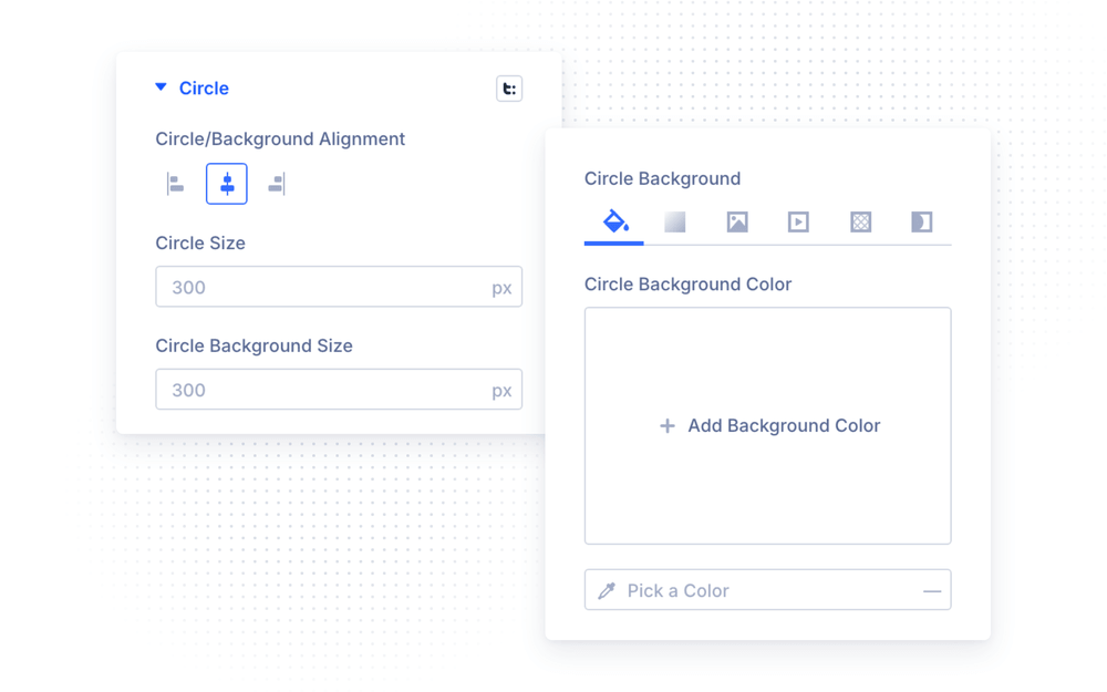
The Circle group controls the circle itself:
- Circle/Background Alignment — align the circle left, center or right within the module
- Circle Size — the diameter of the text path (default 300px); the circular text follows this circle
- Circle Background Size — the diameter of the visible background circle, independent of the text path
- Circle Background — full Divi background options (color, gradient, image) for the background circle
- Circle Background Border — border width and color for the background circle
Because Circle Size and Circle Background Size are independent, you can place a visible disc inside the ring of text (background smaller than the text path) or put the text inside a filled circle (background larger than the text path).
The module wrapper also supports all standard Divi design options — Sizing, Spacing, Border, Box Shadow, Filters, Transform and Animation.
Advanced Settings
The Advanced tab includes all standard Divi options — CSS ID & Classes, Custom CSS, Conditions, Visibility, Transitions, Position, Scroll Effects and Sticky.
In the Custom CSS section, the module exposes dedicated fields for its inner elements:
- Text — the circular text element (
.circular_text) - Content Image — the center image (
.circular_text_center_img) - Content Icon — the center icon (
.circular_text_center_icon) - Circle Background — the background circle (
.circular_text_bg_circle)
Design Ideas
- Rotating badge — set Animate to Continous with a speed of 20–40s, enable Use Icon with a brand icon in the center, and give the Circle Background your brand color.
- Classic stamp — set Animate to Off, enable Use Bottom Text, and balance the two arcs with Starting Offset and Bottom Text Angle.
- Scroll accent — set Animate to On Scroll with a multiplier of 1–2 and small Entry/Exit delays for a subtle, scroll-driven rotation.
- Logo lockup — upload your logo as the Content Image and size the text ring around it with Circle Size.