
Table Maker
Meet the Pixel Table Maker module for Divi! Build fully custom, beautifully styled tables right in the Divi Builder — pricing comparisons, feature matrices, schedules, specification sheets and more. Every cell is its own Divi element with an icon or image, title, rich-text description and button, and on small screens the whole table can transform into stacked blocks or an accordion.
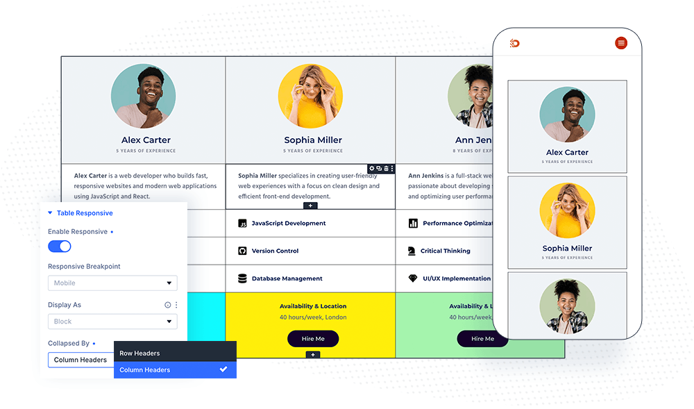
With the Pixel Table Maker module you can:
- Build tables of any size — you set the column count and add as many cells as you need
- Fill each cell with an icon or image, a title, a rich-text description and a button
- Define column headers and row headers and style them separately from regular cells
- Make the table responsive: below a chosen breakpoint it turns into stacked blocks or an accordion
- Span cells across multiple columns, or a full row, with the Col Span options
- Control sizing precisely — table width, cell width and height, and cell overflow behavior
How the module works
The Pixel Table Maker is a parent/child module. The parent module defines the table structure (columns, headers, responsive behavior) and the shared styling, while each child item is one table cell.
Cells fill the table from left to right, wrapping according to the Column Count. A cell with Is New Row enabled starts a new table row. The first rows of the table (as many as the Column Header Count) become column header cells, and the first cell of every remaining row becomes that row’s header — both can be styled independently in the Design tab.
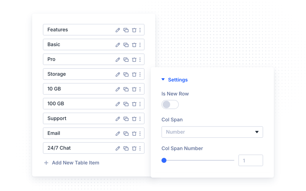
How to add the Table Maker module
- Open a page with the Divi Visual Builder
- Click the + (Add New Module) button
- Search for Pixel Table Maker and click it to insert the module
- Set the Column Count in the Table Settings group
- Add a child Table Maker item for every cell and fill in its content
Table Title and Description
In the Table Title and Description group (Content tab of the parent module), you can add an optional heading and description to the table. Enable Show Table Title and/or Show Table Description, enter the texts, and choose for each whether it appears Above or Below the table. Both are styled in their own Design tab groups (Table Title and Table Description).
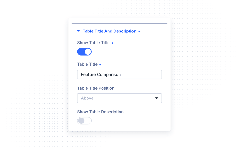
Table Settings
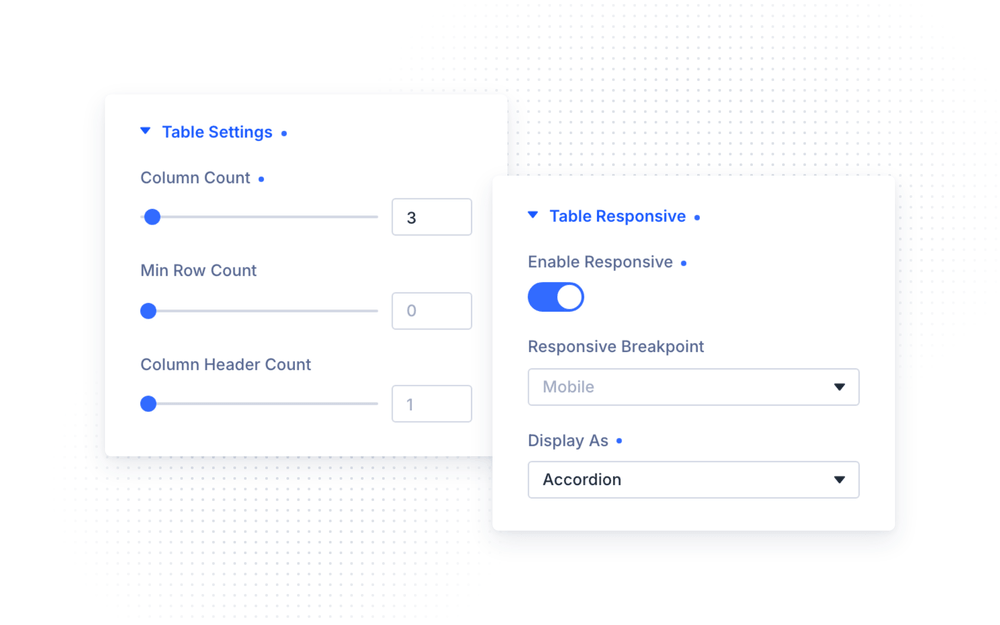
The Table Settings group defines the structure:
- Column Count — the number of columns in the table; cells wrap into rows automatically
- Min Row Count — the minimum number of rows to render, even when you have fewer cells; handy for keeping a consistent height while the table is still being filled
- Column Header Count — how many of the first rows are treated (and styled) as column headers
Table Responsive
Real tables get cramped on phones. In the Table Responsive group you can transform the table on small screens instead of squeezing it:
- Enable Responsive — turn the responsive transformation on
- Responsive Breakpoint — the device size (Desktop, Tablet or Mobile) below which the table transforms
- Display As — display the transformed table as stacked blocks or as an accordion
- Collapsed By — whether the accordion toggles are built from the row headers or the column headers
- Opened Toggle Index(es) — which accordion toggles start opened; toggles are numbered from one, and you can list several separated by commas (e.g.
1,3) - Spacing Between Block/Accordion — the gap between the stacked blocks or accordion items
NOTE: The responsive transformation reorganizes the table around its headers. Give your table proper row and column headers before enabling it — the blocks and accordion toggles are built from them.
Cell Content (child items)
Each child item is one cell, configured in its own settings modal.
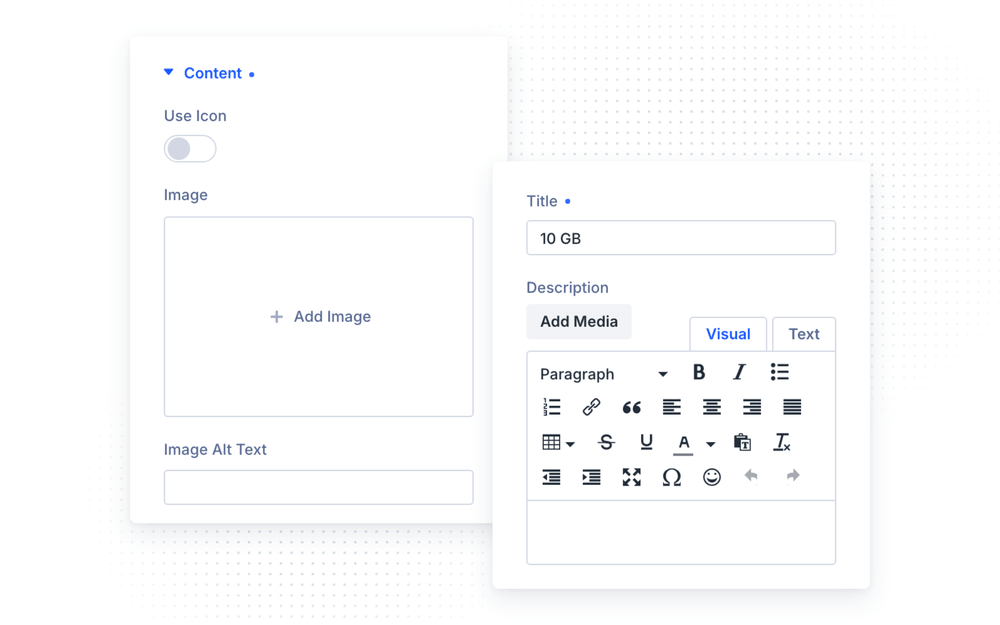
Content
- Use Icon — switch the cell’s visual from an image to a Divi icon; pick it with the Icon picker, or upload an Image (with Image Alt Text) when disabled
- Title — the cell’s heading text
- Description — rich-text content of the cell
- Show Button — adds a button to the cell, with Button Text, Button Link and Button Link Target
Settings
- Is New Row — this cell starts a new table row
- Col Span — make the cell span a Number of columns (set with Col Span Number) or the Full row width — useful for section dividers inside the table
Design Settings
The parent module styles the whole table; most child options default to Parent, so you can restyle a single cell only where needed.
Table & sizing
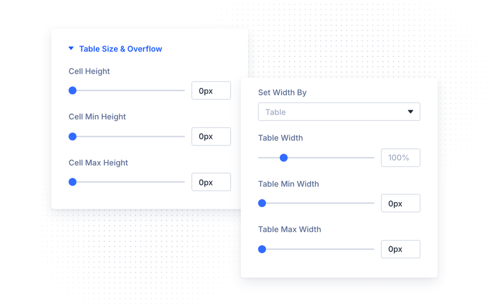
- Table — the Border Collapse mode (
collapsefor shared borders,separatefor spaced cells) plus the table border options - Table Size & Overflow — choose Set Width By: Table (Table Width / Min / Max) or Cell (Cell Width / Min / Max); set Cell Height / Min / Max, and control Cell Horizontal/Vertical Overflow (visible, scroll, auto, hidden)
Cells & headers
- Table Cells — the default Cell Background Color and the content’s Vertical/Horizontal Alignment
- Table Cell Text — the default cell typography
- Column Header Text / Column Header Cells — typography and background for the column header rows
- Row Header Text / Row Header Cells — typography and background for the first cell of each row
Cell content elements
- Content Image & Icon — Icon Color, Image & Icon Background Color, Image & Icon Size, Image/Icon Placement (top, left or right of the text) and Alignment; enable Open Image in Lightbox to make cell images clickable
- Content Button — button alignment, and full Divi button styling after enabling Use Custom Styles For Content Button
Each child item repeats the Image & Icon, Cell Text, Table Cells and Content Button groups with a Parent default, so individual cells can override the table-wide styling — highlight a single column, recolor one row, or give one cell its own button style.
NOTE: The cell content Vertical/Horizontal Alignment options apply when the Image/Icon Placement is set to Left.
Advanced Settings
The Advanced tab includes the standard Divi options — CSS ID & Classes, Custom CSS, Conditions, Visibility, Transitions, Position, Scroll Effects and Sticky.
Design Ideas
- Feature comparison — one column header row with your plan names, row headers with feature names, and check/cross icons in the cells.
- Pricing matrix — put a Full-span cell between sections as a divider, and add buttons in the last row linking to checkout.
- Schedule table — enable Responsive with the Accordion display collapsed by row headers, so each day expands on mobile.
- Spec sheet — two columns (Set Width By Cell), row headers styled with a background color, and
separateborder collapse for an airy look.